Why Seedream 5.0 Pro Works Well for Packaging Design
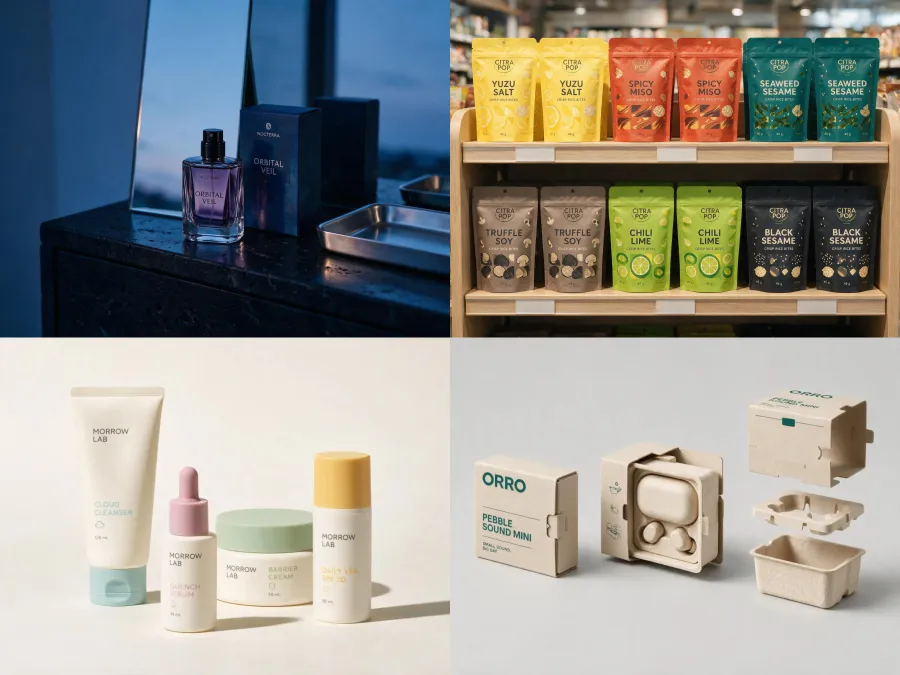
Packaging is a mixed task. The model has to understand the physical container, organize label information, reproduce materials, and place the result in believable light. A model that only makes attractive pictures can easily lose the package structure or turn the label into decoration.
ByteDance’s official Seedream 5.0 Pro introduction reports improvements in image-text alignment, structural coherence, text rendering, and visual aesthetics. Several of its newer controls are directly relevant to packaging work:
-
Text and information hierarchy: Useful for arranging a brand name, product type, variant, benefit line, and net quantity without giving every element equal visual weight.
-
Color and material changes: The model can accept HEX color codes or a reference swatch while replacing an object’s material.
-
Localized editing: Point, lasso, box, and sketch controls can target specific regions in supported interfaces, although the exact controls available depend on the product you use to access the model.
-
Multi-image fusion: A logo, color reference, material sample, and package photo can guide one result.
-
Realistic surfaces: Improved treatment of reflection, refraction, light transmission, and environmental light helps with glass, metal, paperboard, flexible pouches, and translucent plastic.
-
Layer separation: ByteDance demonstrates a poster split into more than 10 editable layers. Do not assume every third-party interface exposes the same layer-export workflow.
The tradeoff is text reliability. Seedream 5.0 Pro is better suited to text-heavy design than many image models, but even ByteDance notes that finer text rendering and pixel-level editing consistency can still improve. Check every letter, number, ingredient, unit, and claim before using an output.
You can try Seedream 5.0 Pro online on GPT Proto with a text prompt or reference images.
A Better Seedream 5.0 Pro Packaging Prompt Formula
Short prompts such as “make luxury coffee packaging” leave nearly every important decision to the model. A more controllable package design prompt names the deliverable, package structure, visual system, exact copy, material, camera view, and elements that must not change.
Use this formula:
[deliverable] + [product and target customer] + [package form]
+ [brand direction] + [label hierarchy and exact text]
+ [materials and print finishes] + [view, setting, and lighting]
+ [details to preserve] + [details to avoid]
For example:
Create a front-facing packaging concept for a premium oat milk brand aimed at
young urban shoppers. Use a one-liter paper carton with a cream base, cobalt-blue
geometric illustration, and restrained sans-serif typography. Display the exact
front-panel text "NORTH OAT", "BARISTA OAT", and "1 L". Use a matte uncoated paper
texture with a small gloss accent around the logo. Show the carton upright in a
clean studio scene with soft side lighting. Keep the hierarchy clear and the
package proportions realistic. No extra slogans, duplicate logos, distorted
panels, unreadable text, hands, or background props.
Two rules improve most results:
-
Put required package copy in quotation marks and keep the first generation’s copy short.
-
When editing an existing package, explicitly state what must remain unchanged: container shape, logo geometry, label position, camera angle, lighting, or product proportions.
20 Seedream 5.0 Pro Package Design Prompts
Create a New Packaging Concept
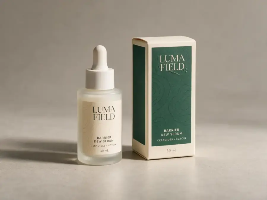
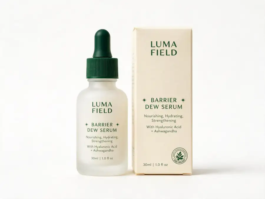
1. Minimalist Skincare Bottle and Carton
Use this prompt for a serum, toner, moisturizer, or other skincare product that needs a clean but distinctive brand system.
Create a complete packaging concept for [PRODUCT TYPE], a skincare product for
[TARGET CUSTOMER]. Show one [BOTTLE TYPE AND SIZE] beside its matching folding
carton. Use a restrained modern identity with [PRIMARY HEX COLOR], [SECONDARY HEX
COLOR], generous negative space, and a subtle [BOTANICAL / GEOMETRIC / SCIENTIFIC]
graphic device. Place the exact front-label text "[BRAND NAME]", "[PRODUCT NAME]",
"[KEY BENEFIT]", and "[NET CONTENT]". Establish a clear hierarchy: brand first,
product name second, benefit line third. Use [FROSTED GLASS / AMBER GLASS / MATTE
PLASTIC] for the bottle and soft-touch uncoated paper for the carton, with a small
[FOIL / EMBOSSED / SPOT GLOSS] accent. Front three-quarter studio view, soft
diffused side light, neutral warm-gray background, realistic contact shadows,
high-end skincare product photography. Keep the bottle and carton proportions
physically plausible. No extra text, duplicate packaging, decorative ingredients,
hands, water splashes, or distorted caps.
Replace: Product type, customer, package size, colors, copy, material, and finish.
Best reference input: Your logo on a transparent background plus a two-color brand palette.
Why this works: It asks for both primary and secondary packaging, then defines a label hierarchy instead of merely requesting a “minimalist” look.
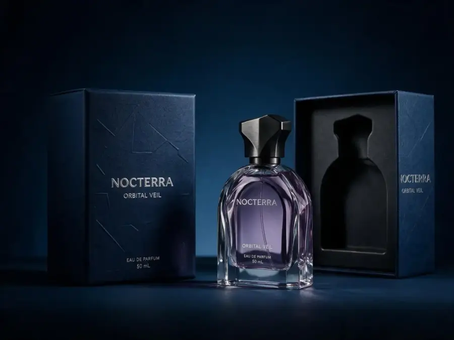
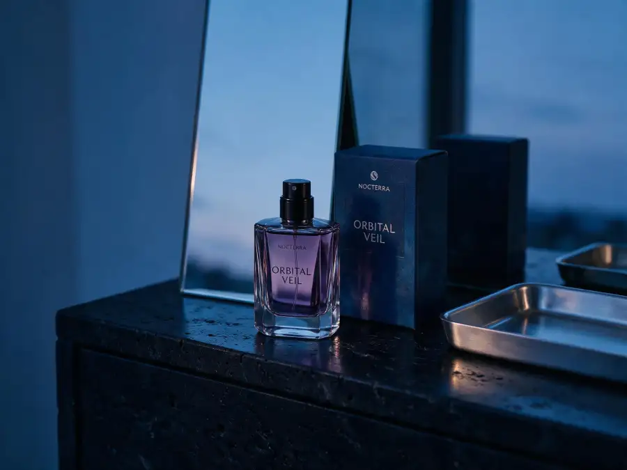
2. Luxury Perfume Bottle and Presentation Box
Design a luxury perfume package for [BRAND NAME] and the fragrance "[FRAGRANCE
NAME]". Create a distinctive [BOTTLE SHAPE] glass bottle containing [LIQUID COLOR],
with a sculptural [CAP MATERIAL] cap and a matching rigid presentation box. The
identity should feel [MOOD: nocturnal / architectural / romantic / avant-garde]
rather than ornate. Display only the exact text "[BRAND NAME]", "[FRAGRANCE NAME]",
"EAU DE PARFUM", and "[VOLUME]". Use [BOX COLOR] paper with [FOIL COLOR] foil
stamping, blind embossing around the brand mark, and a fitted interior tray.
Arrange the closed box, open box, and bottle as one balanced product composition.
Low-key studio lighting with controlled highlights through the glass, realistic
refraction, deep shadows, dark gradient background, editorial fragrance
photography. Preserve crisp bottle edges and readable front-facing typography.
No flowers, smoke, jewelry, people, excessive gold ornament, invented copy, or
misshapen glass.
Replace: Brand, fragrance name, mood, bottle shape, materials, colors, and volume.
Best reference input: A logo, bottle silhouette sketch, or material reference.
Why this works: The prompt separates structural drama from surface decoration, reducing the chance of receiving a generic gold-and-black perfume box.
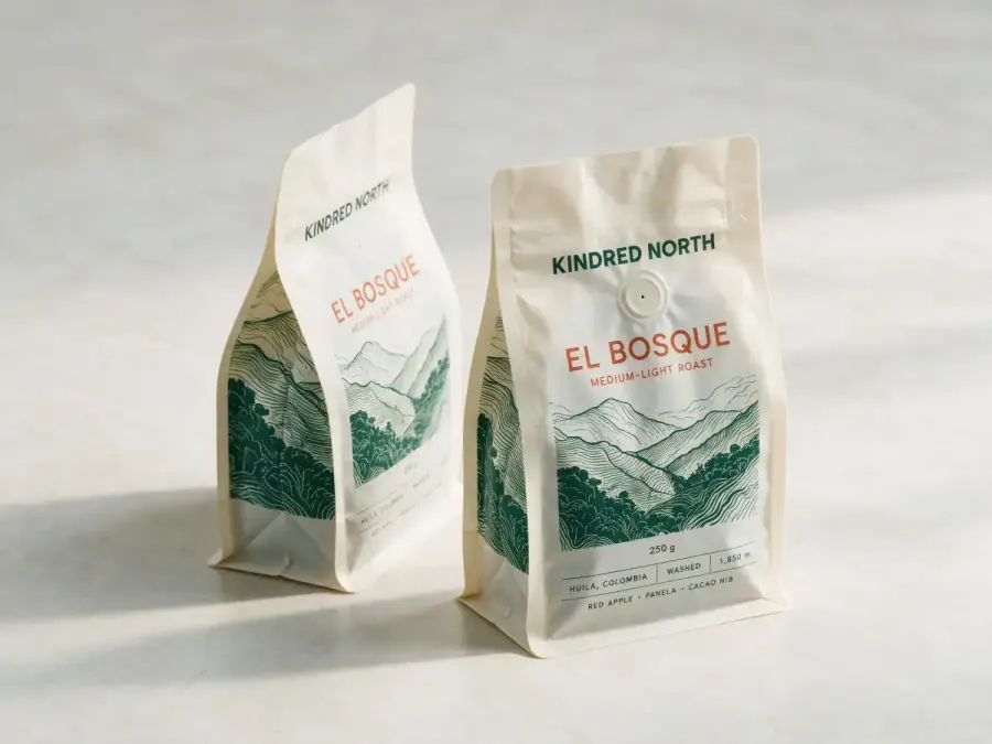
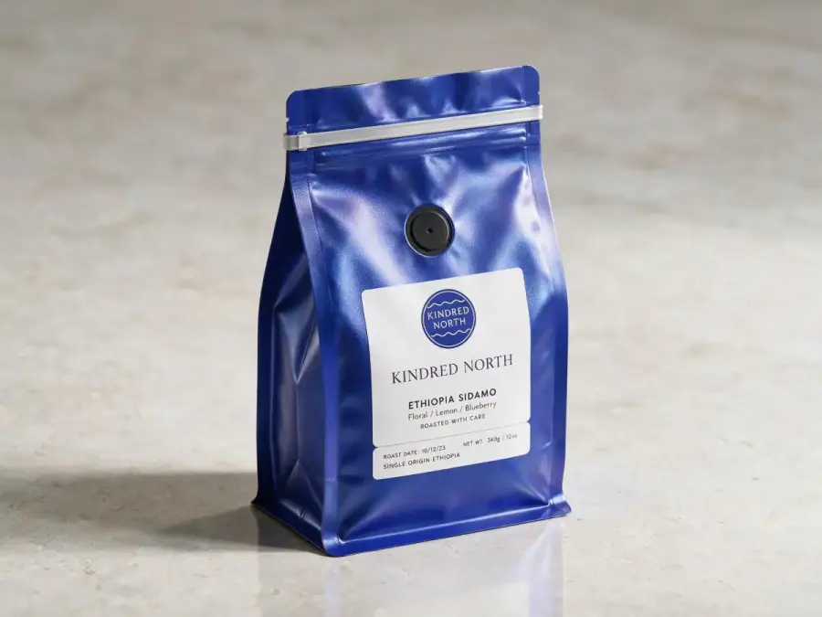
3. Specialty Coffee Stand-up Pouch
Create a front and three-quarter packaging mockup for a [WEIGHT] stand-up coffee
pouch for "[BRAND NAME]". The coffee is "[ROAST / ORIGIN / BLEND NAME]" with tasting
notes of [NOTE 1], [NOTE 2], and [NOTE 3]. Use a [KRAFT PAPER / MATTE FILM / METALLIC
FILM] pouch with a one-way valve and resealable top. Build the visual identity
around [ART DIRECTION], using [PRIMARY HEX COLOR], [ACCENT HEX COLOR], and one
custom illustration inspired by [ORIGIN / LANDSCAPE / PROCESS]. Display the exact
front copy "[BRAND NAME]", "[COFFEE NAME]", "[ROAST LEVEL]", and "[WEIGHT]". Keep
origin, process, altitude, and tasting notes in a smaller organized information
block. Place one upright pouch and one slightly turned pouch on a simple studio
surface, soft morning light, realistic folds, subtle paper texture, accurate
gusset and valve placement. No coffee cup, scattered beans, burlap sacks, extra
badges, duplicate logos, or unreadable microcopy.
Replace: Coffee details, art direction, colors, materials, and exact copy.
Best reference input: Your current logo and one illustration-style reference.
Why this works: It includes real pouch construction details and keeps secondary coffee information subordinate to the brand and blend name.
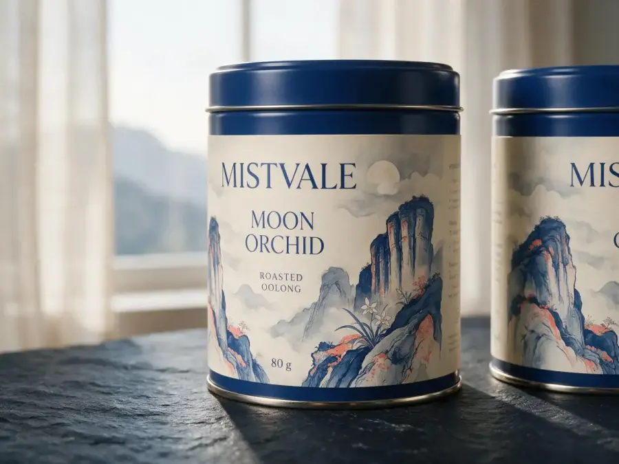
4. Premium Tea Tin with Illustrated Label
Design a premium cylindrical tea tin for [TEA TYPE] from [REGION]. The brand is
"[BRAND NAME]" and the blend is "[PRODUCT NAME]". Use a [TIN COLOR] metal tin with
a fitted lid and a wraparound paper label. Create an original [BOTANICAL /
LANDSCAPE / MYTHIC / ABSTRACT] illustration related to [TEA ORIGIN OR FLAVOR],
using [COLOR PALETTE] and refined [SERIF / SANS-SERIF] typography. The front panel
must show the exact text "[BRAND NAME]", "[PRODUCT NAME]", "[TEA TYPE]", and
"[NET WEIGHT]". Reserve a quiet side area for brewing instructions without
inventing detailed text. Show the tin upright with a second view revealing the
wraparound artwork. Soft directional window light, dark wood or stone surface,
realistic metal edge highlights, controlled shadows, elegant editorial still
life. Keep the illustration original and culturally respectful. No teacup,
loose tea leaves, flowers covering the label, random Asian characters, or extra
brand names.
Replace: Tea, region, illustration direction, palette, typography, and copy.
Best reference input: A mood board for illustration and cultural references from the product’s actual origin.
Why this works: It asks the model to design around the cylindrical surface instead of treating the package like a flat poster.
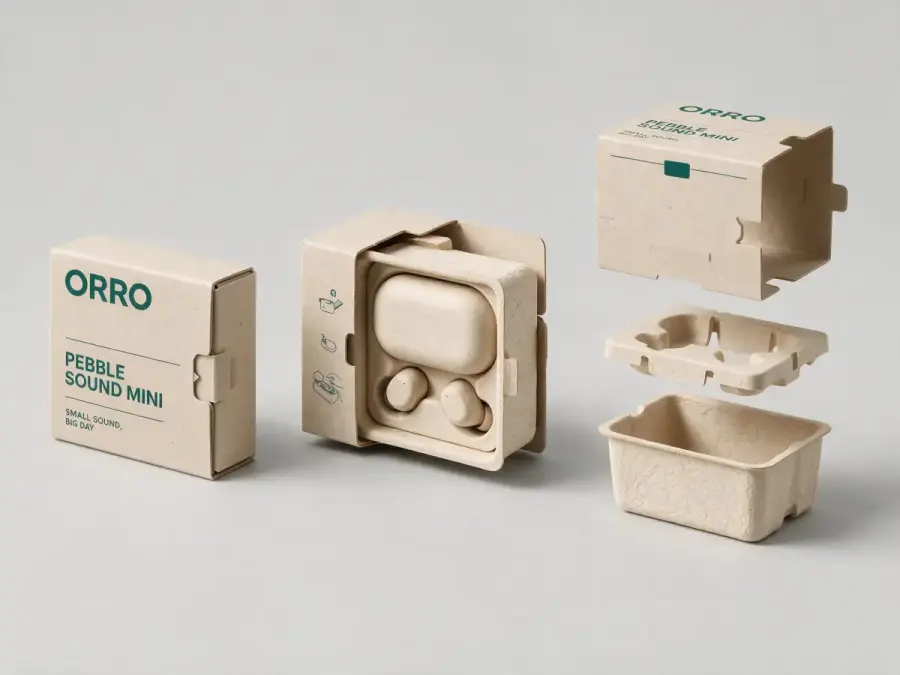
5. Sustainable Structural Packaging Box
Create a sustainable structural packaging concept for [PRODUCT], designed for
[CUSTOMER AND SALES CHANNEL]. Use a compact [TUCK-END BOX / SLEEVE AND TRAY /
FOLDING MAILER / MOLDED-PULP INSERT] that protects the product with minimal empty
space. Materials: unbleached recycled paperboard, molded fiber, and one-color
[INK COLOR] printing. Avoid plastic windows, magnets, foam, and unnecessary
lamination. Show the package closed, open, and as a simple exploded assembly
view, all representing the same structure. Add the exact exterior text "[BRAND
NAME]", "[PRODUCT NAME]", and "[SHORT VALUE LINE]". Use clear instructional
icons without fabricated certifications. Neutral studio background, even
technical product lighting, realistic folds, tabs, thickness, and locking
mechanisms. The structure must look manufacturable and easy to assemble. No
green leaves as decoration, fake eco labels, impossible floating parts, excess
packaging, or hidden product.
Replace: Product, sales channel, box structure, color, and copy.
Best reference input: Product dimensions, a rough dieline sketch, and a photo of the item that must fit inside.
Why this works: The prompt asks for three consistent views and specifies structural constraints rather than using sustainability as a visual style.
Redesign an Existing Product Package
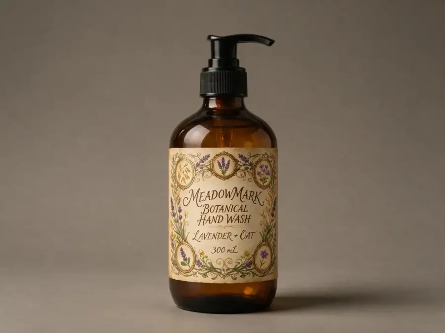
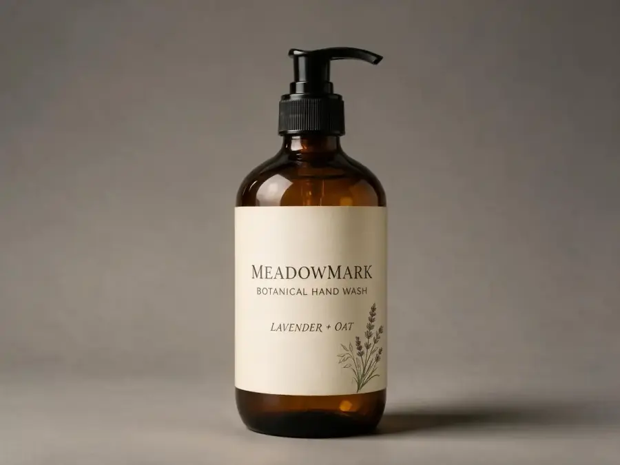
6. Modernize an Outdated Product Label
Upload a clear photo of the existing package before using this prompt.
Redesign only the label on the uploaded [PRODUCT TYPE] package. Preserve the
container shape, cap, label dimensions, camera angle, product proportions,
lighting, shadows, and background exactly as shown. Keep the existing [LOGO /
BRAND MARK] recognizable and in the same general position. Modernize the label
with a clearer three-level hierarchy: "[BRAND NAME]" first, "[PRODUCT NAME]"
second, and "[VARIANT OR BENEFIT]" third. Replace the dated [DESCRIBE OLD ELEMENT]
with [NEW VISUAL DIRECTION]. Use [PRIMARY HEX COLOR], [SECONDARY HEX COLOR], and
[TYPE STYLE]. Reduce visual clutter and remove redundant badges. Render one
photorealistic revised package, matching the original perspective and label
curvature. Do not alter the bottle, cap, fill level, package size, logo geometry,
or scene. Do not add claims, certifications, ingredients, or text that was not
provided.
Replace: Existing problem, new visual direction, colors, type style, and exact copy.
Best reference input: A front or three-quarter product photo plus a separate high-resolution logo.
Why this works: “Redesign only the label” is reinforced by a detailed preservation list, which helps prevent a full product replacement.
7. Change the Material and Brand Colors from References
Upload three images: the package to edit, the desired material, and the brand color swatch.
Edit the package in Image 1. Apply the surface material and finish shown in
Image 2 to the package body, and recolor the main package area using the exact
brand color [HEX CODE] shown in Image 3. Keep the original package shape, seams,
cap or closure, label placement, logo, text, perspective, scale, background,
lighting direction, reflections, and contact shadow unchanged. Adapt the new
material naturally around curves, folds, and edges. Preserve the logo color
unless it loses contrast; if contrast is insufficient, change only the logo to
[ALTERNATE HEX CODE]. Output one photorealistic edited product image. No new
decorations, no extra copy, no background changes, no duplicate packages, and
no altered camera angle.
Replace: HEX codes and the role of each uploaded reference.
Best reference input: A high-resolution package photo, close-up material sample, and flat brand swatch.
Why this works: Each reference has one job. That is more controllable than asking the model to “combine these images” without defining what to take from each one.
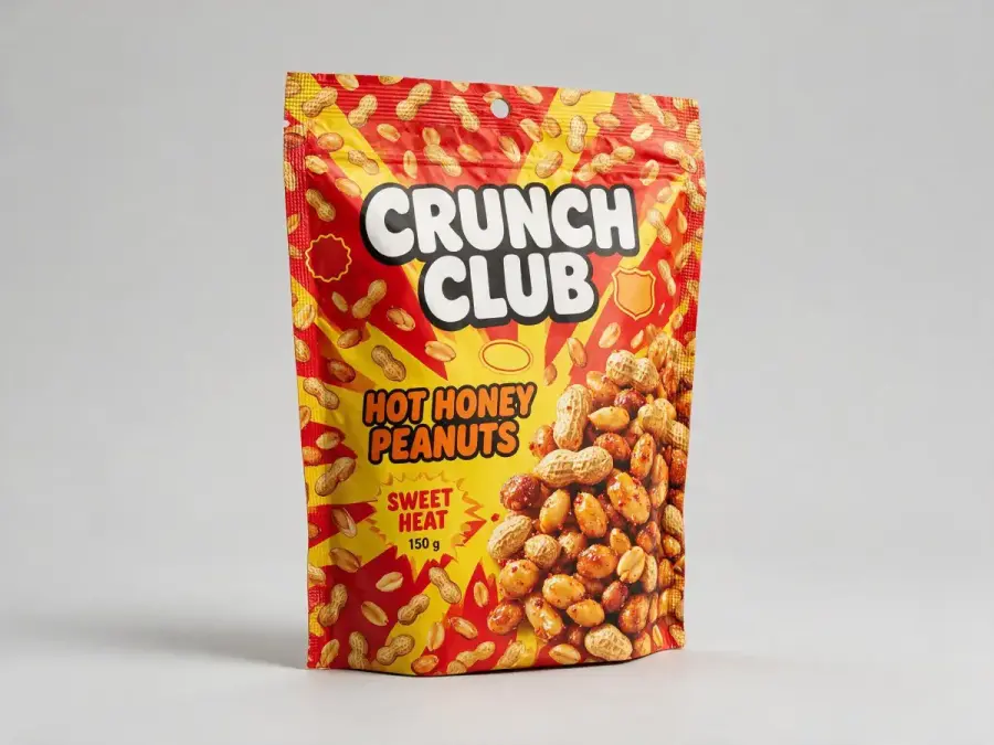
8. Premiumize a Budget FMCG Package
Redesign the uploaded [SNACK / DRINK / HOUSEHOLD / PERSONAL-CARE] package for a
more premium retail position while keeping the product recognizable. Preserve
the package format, physical dimensions, brand name, logo geometry, flavor or
variant, and main product image. Simplify the front panel to a clear hierarchy:
logo, product name, variant, then one short benefit line. Replace the crowded
[OLD PATTERN / BADGES / COLOR BURSTS] with [NEW ART DIRECTION]. Use [DEEP COLOR],
[NEUTRAL COLOR], and one controlled [METALLIC / EMBOSSED / GLOSS] accent.
Improve spacing, alignment, and contrast while retaining enough shelf visibility
for the product category. Show the revised package in the same camera view and
lighting as the original. No black-and-gold cliché unless specified, no invented
awards, no false quality claims, no removal of legally required information,
and no change to the product itself.
Replace: Category, elements to retain, old design problem, new art direction, and palette.
Best reference input: The current package and two premium references from adjacent—not identical—product categories.
Why this works: It defines premiumization as hierarchy, spacing, and materials rather than automatically turning everything black and gold.
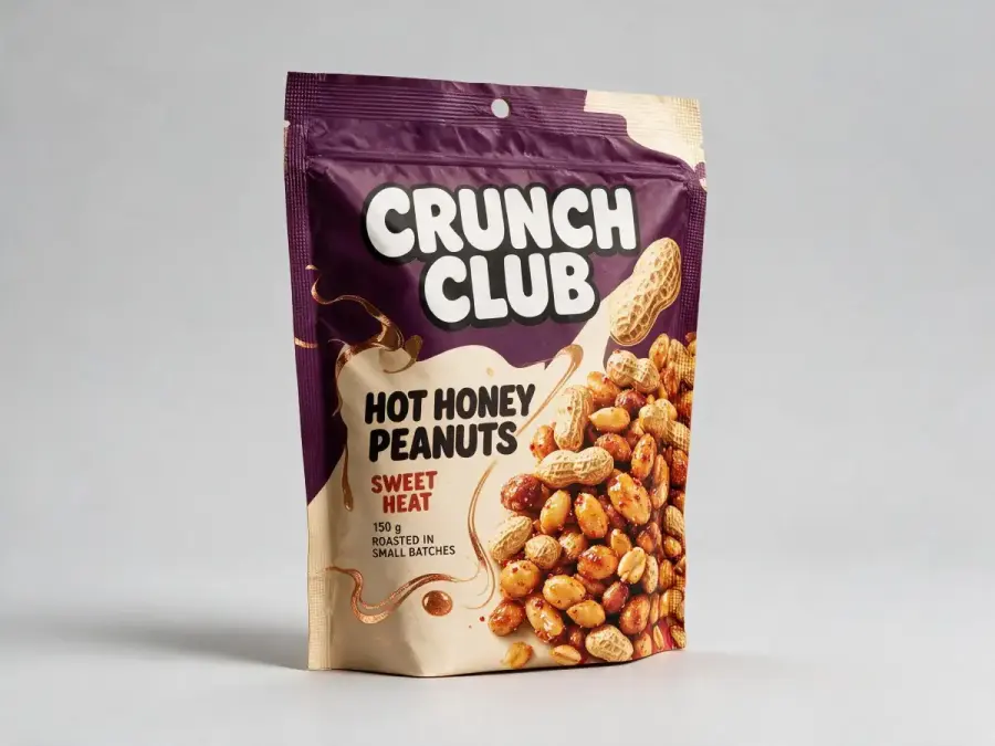
9. Seasonal Limited-edition Package
Create a [SEASON / FESTIVAL / EVENT] limited-edition version of the uploaded
[PRODUCT] package. Preserve the package structure, brand logo, core brand colors,
product name, variant coding, camera angle, and recognizable shelf identity.
Introduce a limited-edition visual system inspired by [SPECIFIC CULTURAL OR
SEASONAL MOTIF], using [ACCENT COLOR] and [ILLUSTRATION OR PATTERN STYLE]. Add
only the exact temporary copy "[LIMITED-EDITION LINE]". Integrate the seasonal
elements into the existing label or print area rather than covering the logo or
product name. Show one clean hero package and one close-up of the special finish
[FOIL / EMBOSS / HOLOGRAPHIC FILM / SPOT GLOSS]. Keep the result contemporary
and respectful. No generic holiday clip art, random cultural symbols, extra
slogans, date claims, gift props, or changes to the physical package.
Replace: Occasion, motif, accent color, temporary copy, and finish.
Best reference input: Existing package, an approved cultural mood board, and the brand guide.
Why this works: It preserves brand recognition while limiting the seasonal intervention to controlled areas.
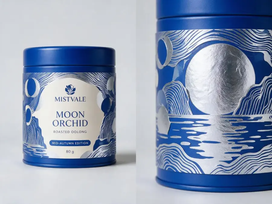
10. Localize Packaging for Another Market
Adapt the uploaded [PRODUCT] packaging for [TARGET COUNTRY OR LANGUAGE]. Preserve
the package shape, brand logo, product identity, primary colors, illustration
style, and overall hierarchy. Replace only the front-facing marketing copy with
the following approved localized text: "[BRAND NAME]", "[LOCALIZED PRODUCT NAME]",
"[LOCALIZED VARIANT]", and "[LOCALIZED SHORT LINE]". Follow the reading direction,
punctuation, and typographic conventions of [LANGUAGE]. Rebalance the spacing so
the translated copy fits naturally without shrinking it into unreadable text.
Keep all regulatory, nutrition, ingredient, barcode, recycling, and certification
areas as clearly marked placeholders for later legal review. Render a front and
three-quarter packaging mockup with the same lighting as the source. No literal
translation of unprovided copy, no invented claims, no random cultural motifs,
no altered logo, and no fabricated compliance marks.
Replace: Market, language, and legally approved localized front copy.
Best reference input: Existing package, approved translation, local brand guide, and market-specific compliance template.
Why this works: It uses AI for visual localization but explicitly removes regulatory copy from the model’s responsibility.
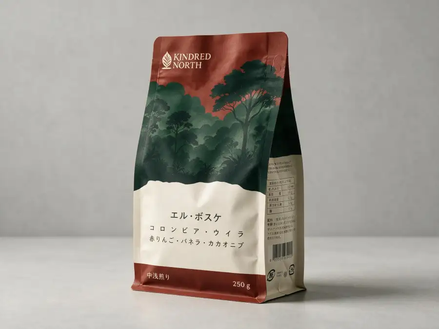
Build a Consistent Product Range
11. Three-flavor Snack Package Family
Design a coordinated family of three [SNACK TYPE] packages for "[BRAND NAME]":
"[FLAVOR 1]", "[FLAVOR 2]", and "[FLAVOR 3]". Use the same package structure,
logo size, typographic grid, product-name position, illustration style, and
information hierarchy across all three SKUs. Give each flavor a distinct code:
[COLOR 1 + INGREDIENT MOTIF], [COLOR 2 + INGREDIENT MOTIF], and [COLOR 3 +
INGREDIENT MOTIF]. Display the exact shared copy "[BRAND NAME]" and "[PRODUCT
LINE]", plus each exact flavor name. The packages should read as one family from
a distance while remaining easy to distinguish on a shelf. Arrange all three
upright in a front three-quarter lineup, even studio lighting, light neutral
background, realistic flexible-film folds and sealed edges. No flavor colors
that merge together, no changing logo placement, no duplicate flavor names, no
loose food exploding from the bags, and no extra badges.
Replace: Snack type, brand, product line, flavors, colors, and ingredient motifs.
Best reference input: Logo, master layout, and one approved illustration reference.
Why this works: It locks the shared system first, then varies only the flavor-coding layer.
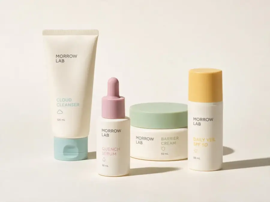
12. Skincare Range Across Bottle, Tube, and Jar
Create a four-product skincare packaging system for "[BRAND NAME]": [CLEANSER]
in a tube, [SERUM] in a dropper bottle, [MOISTURIZER] in a jar, and [SUNSCREEN]
in a pump bottle. Use one consistent brand grid, logo position, typographic
family, cap style, material language, and icon system across the different
container shapes. Base color [PRIMARY HEX COLOR]; assign a subtle accent color
to each product: [ACCENT 1], [ACCENT 2], [ACCENT 3], and [ACCENT 4]. Show only
the exact product names and volumes provided. Keep the containers physically
plausible and correctly scaled relative to one another. Arrange the four
products as a balanced family portrait on a clean studio surface, soft clinical
lighting with warm natural shadows, front three-quarter view. No decorative
water, leaves, laboratory glassware, floating caps, inconsistent logos, or
invented skincare claims.
Replace: Product names, packaging formats, colors, and exact volumes.
Best reference input: Brand guide, logo, and rough size chart for all containers.
Why this works: It distinguishes brand consistency from container uniformity; the formats can change while the design system stays recognizable.
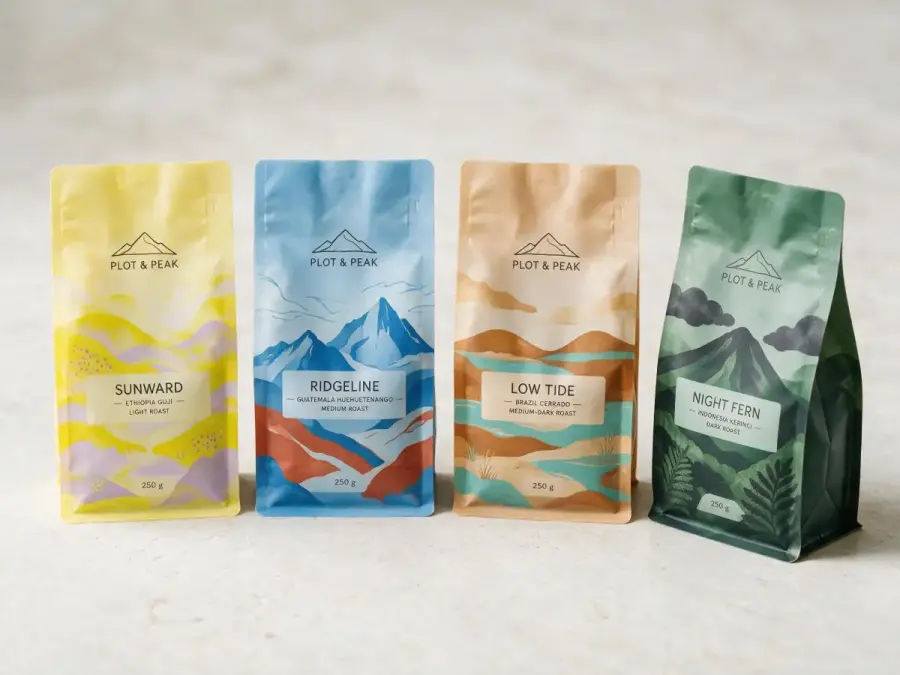
13. Coffee Collection with Color-coded Variants
Create a collection of four specialty coffee pouches for "[BRAND NAME]":
"[COFFEE 1]", "[COFFEE 2]", "[COFFEE 3]", and "[COFFEE 4]". Maintain the same
pouch dimensions, brand mark, label grid, type system, origin-data block, and
illustration style. Give each coffee a color code based on its tasting profile:
[PALETTE 1], [PALETTE 2], [PALETTE 3], and [PALETTE 4]. Include only the exact
names, roast levels, and weights supplied. Use small abstract illustrations
inspired by each coffee’s [ORIGIN / PROCESS / TASTING NOTES], but keep the set
visually related. Display a straight-on lineup plus one angled pouch showing the
side gusset. Soft daylight, pale stone surface, realistic matte film and folds,
clear shelf-readable typography. No coffee cups, beans, farm portraits, national
flags, random certification seals, or inconsistent pouch sizes.
Replace: Coffee names, roast information, palettes, origins, and weights.
Best reference input: A master pouch, color palette, and product data sheet.
Why this works: The master grid stays fixed while flavor and origin cues provide controlled differentiation.
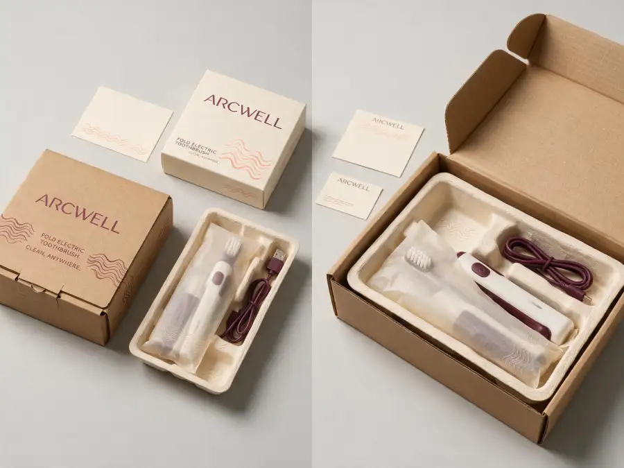
14. Primary Package, Shipping Box, and Unboxing System
Design a connected packaging and unboxing system for [PRODUCT] by "[BRAND NAME]".
Include the retail package, an e-commerce shipping box, a molded paper insert,
one protective wrap, a thank-you card, and one small instruction card. Use the
same [COLOR PALETTE], logo treatment, type family, and graphic motif across every
touchpoint. The retail package should feel polished; the outer shipping box
should use fewer inks and withstand handling. Display the exact exterior copy
"[BRAND NAME]" and "[SHORT LINE]"; keep instructional and legal text as blank
layout placeholders. Show one overhead flat lay of every component and one open
shipping-box view with the product secured inside. Neutral daylight studio,
realistic corrugated board, paper texture, folds, tabs, and scale relationships.
Minimize empty space and avoid plastic filler. No ribbons, confetti, unrealistic
floating components, fake recycling marks, or excess decorative packaging.
Replace: Product, palette, copy, components, and graphic motif.
Best reference input: Product dimensions, retail package, logo, and shipping constraints.
Why this works: It separates the roles of retail and transit packaging while keeping one brand language across both.
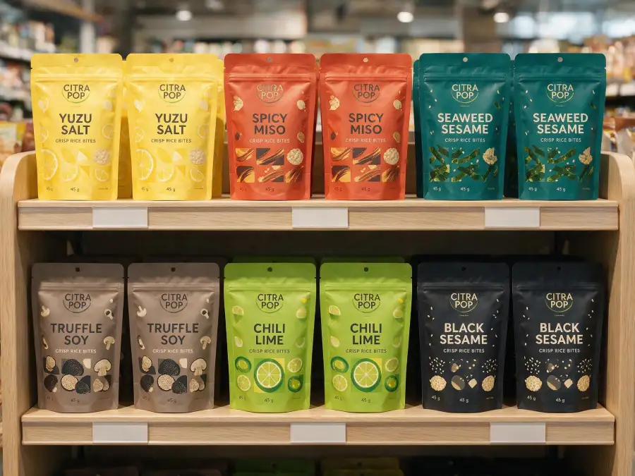
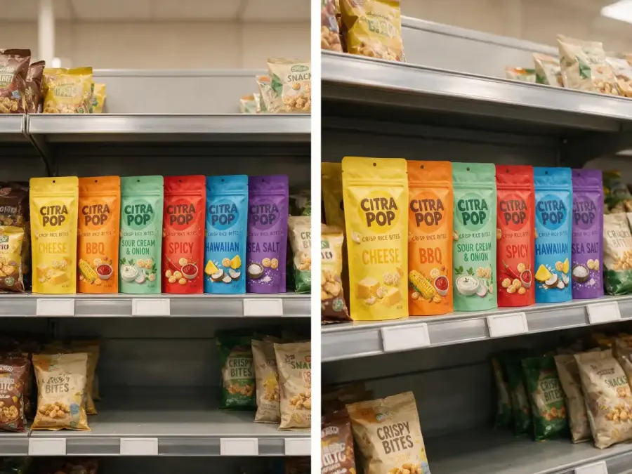
15. Shelf-ready Product Lineup
Create a shelf-ready lineup for six [PRODUCT CATEGORY] SKUs from "[BRAND NAME]".
Use the uploaded master package as the design anchor. Preserve its logo, grid,
type system, package shape, and main visual motif across every SKU. Differentiate
the six variants with [COLOR-CODING RULE] and [SECONDARY MOTIF RULE]. Place the
exact product and variant names supplied; do not invent additional products.
Arrange the six packages in a realistic retail shelf section with correct scale,
front-facing packs, two facings per SKU, shelf-edge label placeholders, and
natural store lighting. The brand block should remain recognizable from several
meters away, while adjacent colors must be easy to tell apart. Include a clean
straight-on category view, not a dramatic advertisement. No competing brands,
random price claims, duplicated SKUs, warped shelves, floating products, or
oversized packaging.
Replace: Category, SKU names, color rule, and motif rule.
Best reference input: Master package, complete SKU list, and a photo of the target retail shelf.
Why this works: It tests the range as shoppers will see it rather than judging each pack in isolation.
Turn Packaging into E-commerce and Campaign Visuals
16. Clean Marketplace Hero Image
Using the uploaded package photo as the only product reference, create a square
1:1 marketplace hero image for [PRODUCT]. Preserve the package shape, label,
logo, colors, cap or closure, proportions, and all visible product details.
Place one product centered on a pure white background with even high-key studio
lighting, a soft natural contact shadow, clean edges, and no perspective
distortion. The product should fill approximately 80% of the frame while
remaining fully visible. Keep the front label facing the camera and improve
clarity without redesigning it. No props, hands, badges, added copy, reflections
that obscure the label, extra packages, cropped edges, watermarks, or changes to
the product.
Replace: Product name and any marketplace-specific framing requirement.
Best reference input: The clearest front three-quarter product photo available.
Why this works: It treats the package as a fixed product asset, not as an invitation to redesign it.
17. Premium Lifestyle Product Photograph
Create a vertical 4:5 lifestyle product photograph using the uploaded [PRODUCT]
package. Preserve the exact package design, logo, label copy, color, shape, and
proportions. Place it in [SPECIFIC USE ENVIRONMENT] with [TWO OR THREE RELEVANT
PROPS] that support the product story without hiding the label. Art direction:
[MOOD], [TIME OF DAY], [COLOR PALETTE], and [MATERIAL SETTING]. Use realistic
environmental light, accurate shadows, reflections appropriate to the package
material, and a clear focal hierarchy with the package as the hero. Leave clean
negative space in [TOP / LEFT / RIGHT] for later campaign copy, but do not
generate text there. No redesigned label, duplicate product, unrelated props,
people unless requested, artificial glow, floating ingredients, or obstructed
brand name.
Replace: Environment, props, mood, time, palette, material setting, and copy space.
Best reference input: Product cutout plus a separate lighting or location reference.
Why this works: It defines the lifestyle scene while protecting the uploaded package as the source of truth.
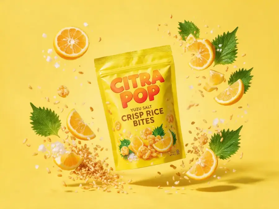
18. Exploded Ingredient Composition
Create a dynamic advertising still for the uploaded [FOOD / DRINK / BEAUTY]
package, using a vertical 4:5 composition. Preserve the package exactly: logo,
label, shape, color, cap, and proportions. Position it upright at the center.
Arrange the following real ingredients around it in a controlled exploded
composition: [INGREDIENT 1], [INGREDIENT 2], [INGREDIENT 3], and [INGREDIENT 4].
Show each ingredient clearly and at a believable scale, with curved directional
movement leading the eye back to the package. Use [BACKGROUND COLOR], crisp
commercial lighting, short-motion detail on smaller particles, realistic
shadows, and clean negative space for later typography. The image should
communicate flavor or formulation without making a medical or nutritional
claim. No extra ingredients, no liquid covering the label, no floating package,
no generated slogans, no duplicate logos, and no change to the product design.
Replace: Category, approved ingredients, background color, and motion level.
Best reference input: Package cutout and clear photos of the actual ingredients.
Why this works: The ingredient list is closed and explicit, preventing the model from adding attractive but inaccurate product associations.
19. Supermarket Shelf Visibility Mockup
Place the uploaded [PRODUCT] package into a realistic [SUPERMARKET / PHARMACY /
BEAUTY STORE] shelf environment to test shelf visibility. Preserve the package
design exactly. Show [NUMBER] facings at normal retail scale among softly
de-emphasized generic neighboring products with no readable brand names. Camera
at shopper eye level, straight-on aisle view, natural overhead store lighting,
accurate shelf depth, price-rail placeholders, and believable product spacing.
Keep the uploaded brand color and logo clearly visible without making the
package larger than its category competitors. Output one wide shelf-context
image and one closer crop of the product block. No invented price, discount
badge, competitor trademarks, distorted shelves, duplicated labels, floating
packs, or dramatic spotlight.
Replace: Retail environment, number of facings, and product category.
Best reference input: Package image plus a photo of the actual category shelf.
Why this works: It creates a more honest visibility test by keeping the package at normal scale and avoiding theatrical lighting.
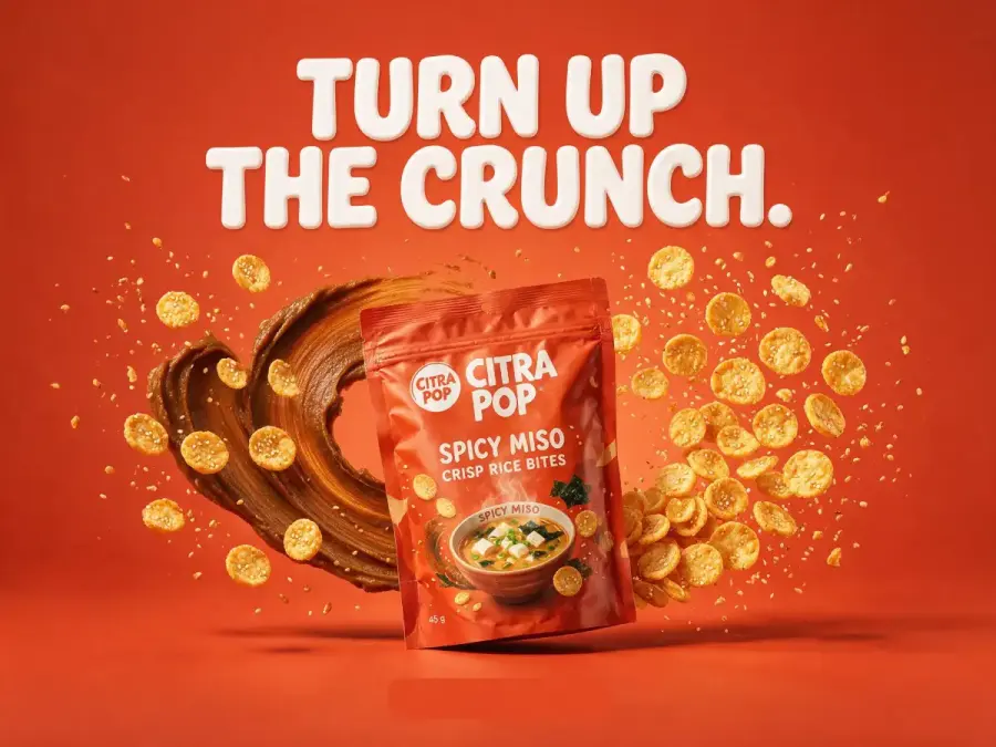
20. FMCG Advertising Poster Built Around the Package
Create a bold vertical 4:5 FMCG campaign poster for the uploaded [PRODUCT].
Preserve the package design, logo, text, shape, color, and proportions exactly.
Build the composition around [CAMPAIGN IDEA], using [BACKGROUND COLOR OR SET],
[KEY VISUAL ELEMENT], and [MOTION OR TEXTURE EFFECT]. Place the package in the
clearest focal position with realistic support, shadows, and material response.
Reserve one clean headline area and one smaller offer or CTA area. Render only
the exact approved headline "[HEADLINE]" and no other marketing copy. Use a
clear commercial hierarchy: headline first, product second, supporting visual
third. Keep the image energetic but readable at mobile size. No redesigned
packaging, fake discount, unapproved claim, random ingredients, duplicate
product, malformed typography, hidden logo, or excessive decorative elements.
Replace: Campaign idea, set, key visual, effect, and approved headline.
Best reference input: Product cutout, campaign mood board, and brand type reference.
Why this works: It treats the package, campaign idea, and text zones as separate controlled layers instead of asking for a vague “viral ad.”
How to Refine a Package Without Redesigning Everything
The first result rarely needs a completely new prompt. Seedream 5.0 Pro is designed for iterative editing, so the better move is often to isolate one problem and protect everything else.
Change Only the Label Copy
Edit only the text inside the front label. Replace "[OLD TEXT]" with the exact
text "[NEW TEXT]". Match the existing font style, weight, baseline, spacing,
perspective, print texture, and label curvature. Preserve the logo, package
shape, colors, artwork, materials, cap, background, lighting, camera angle,
shadows, and every other element unchanged. Do not add, remove, or reposition
anything outside the specified text area.
Change Only the Material and Main Color
Change only the package body from [CURRENT MATERIAL] to [NEW MATERIAL] and
change its main color to [HEX CODE]. Adapt highlights, reflections, texture,
folds, and shadows naturally to the new material. Preserve the package structure,
label, logo, all text, proportions, position, camera angle, background, and
lighting unchanged. Do not redesign the label or add any new elements.
Fix a Failed Generation
Use short repair prompts that name one defect:
-
“Correct only the spelling of ‘[WORD]’; preserve the layout and all other text.”
-
“Make all three pouches the same height and width; preserve each flavor color.”
-
“Restore the original logo geometry from Image 1; change nothing else.”
-
“Remove the extra cap behind the bottle; preserve the bottle and shadow.”
-
“Straighten the front label and keep it wrapped naturally around the cylinder.”
One main correction per pass makes it easier to see whether the edit worked.
What AI Packaging Images Are—and Are Not—Ready For
Seedream 5.0 Pro can shorten visual exploration, but a photorealistic mockup is not evidence that a package can be manufactured or legally sold.
| Suitable for AI-assisted exploration |
Still requires professional production work |
| Early packaging concepts and mood boards |
Structural engineering and production dielines |
| Label redesign directions |
Bleed, safe areas, folds, cuts, and glue zones |
| Color, material, and finish visualization |
CMYK or spot-color setup and substrate testing |
| Product-range planning |
Trapping, overprint, separations, and press specifications |
| E-commerce mockups and campaign directions |
Barcode generation and scan verification |
| Client presentations and internal reviews |
Ingredients, allergens, claims, legal copy, and local compliance |
| Digital soft concepts |
Physical proofing and final production approval |
Esko’s packaging prepress guide separates visual design from the technical work required for print-ready output, including dielines, color management, trapping, barcode checks, compliance review, proofing, and press preparation.
Food packaging needs an additional layer of caution. The FDA Food Labeling Guide explains that food labels are governed by specific laws and regulations, and its page flags parts of the older guide that are being updated. In practice, that means AI-generated nutrition, allergen, ingredient, or health-claim text should always be treated as placeholder content until it has been checked against current rules for the target market.
The simple rule: use Seedream to decide what the package could look like. Do not ask it to decide what the package is legally required to say.
Try These Packaging Prompts with Seedream 5.0 Pro
Start with one of the text-to-image prompts above, or upload an existing package and use one of the editing prompts. You can run Seedream 5.0 Pro online on GPT Proto, then refine the strongest direction one controlled edit at a time.
For other subjects and visual tasks, browse the Seedream 5.0 Pro prompt collection. If you want a broader explanation of reference images, editing instructions, and prompt structure, read the Seedream 5.0 Pro prompt guide.