Quick Picks: Which Nano Banana Pro Prompt Should You Use?
| What you want to create |
Start with |
Reference image needed? |
Suggested ratio |
| Maximalist beverage product poster |
Prompt 15 |
Recommended |
4:5 |
| Food campaign visual |
Prompt 1 or 3 |
Optional |
4:5 |
| Product infographic |
Prompt 4 |
Recommended |
1:1 |
| Brand identity board |
Prompt 2 |
Optional |
16:9 |
| Ad storyboard |
Prompt 6 |
Recommended |
16:9 |
| Social performance ad |
Prompt 16 or 19 |
Recommended |
4:5 |
| Consistent portrait variations |
Prompt 12 |
Yes |
1:1 |
| Interior design mood board |
Prompt 13 |
Yes |
3:4 |
| Travel poster |
Prompt 14 |
Optional |
2:3 |
| Hand-drawn destination illustration |
Prompt 20 |
No |
3:4 |
How We Selected These Nano Banana Pro Prompts
These are not ranked by how many adjectives they contain. Each prompt had to meet at least four practical criteria:
It produces a clearly defined deliverable rather than a vague “beautiful image.”
It contains variables that can be reused for another brand, product, person, or location.
It controls composition, materials, lighting, typography, or what must remain unchanged.
It solves a real creative or commercial task.
It can be repaired with a short follow-up instruction instead of a complete rewrite.
The example outputs help you judge the concept, but they are not a guarantee that every label, landmark, logo, or hand will be correct on the first generation. Exact text and brand assets still need a human review before publication.
Nano Banana Pro Prompts for Products, Food, and Ecommerce
1. Floating-Ingredients Food Poster
Best for: Restaurant campaigns, menu covers, recipe explainers, and regional food content
Reference image: Optional; recommended when the dish must match a real recipe
Recommended ratio: 4:5 or 2:3
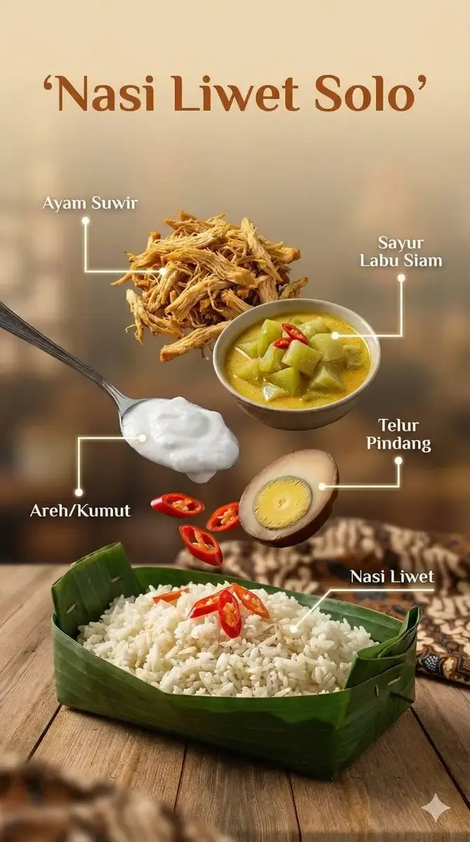
Copy this prompt:
Create an ultra-realistic cinematic food advertisement for [DISH NAME], a traditional dish from [COUNTRY OR REGION]. Place the finished dish in the lower third of the composition in a [RUSTIC CERAMIC BOWL / BANANA-LEAF PLATE / OTHER SERVING VESSEL].

Suspend these key ingredients above the dish in a clear vertical arrangement: [INGREDIENT 1], [INGREDIENT 2], [INGREDIENT 3], [INGREDIENT 4], and [INGREDIENT 5]. Keep every ingredient visually separate and label it with the exact supplied name in [LABEL LANGUAGE], using clean minimalist typography and thin pointer lines.

Freeze small splashes of [SAUCE OR BROTH] and particles of [SPICE OR GARNISH] in mid-air as if captured with high-speed food photography. Add realistic steam rising from the finished dish. Set the scene in [LOCATION OR CULTURAL SETTING], with [BACKGROUND ELEMENTS] visible but softly blurred.

Lighting: warm natural sunlight with soft cinematic fill light.
Camera: close commercial food shot, shallow depth of field, crisp detail on the dish and suspended ingredients.
Materials: realistic glossy sauce, individual grains, fresh herbs, ceramic or leaf texture, natural shadows.
Output: premium editorial food-poster composition, high detail, 4K or the highest available resolution. No watermark. Do not invent ingredient labels beyond the supplied list.
Change these details: [DISH NAME], [COUNTRY OR REGION], [INGREDIENTS], [LABEL LANGUAGE], and [BACKGROUND ELEMENTS].
Why it works: The prompt separates the hero dish, ingredient sequence, label system, motion effects, and environment. That gives the model a layout to follow instead of asking it to improvise a complete food poster from one sentence.
If the labels or ingredients drift:
Keep the dish, camera angle, lighting, serving vessel, and ingredient positions unchanged. Correct only the ingredient labels so they use this exact list and spelling: [PASTE FINAL LABEL LIST]. Remove any extra labels or ingredients.
2. Six-Panel Brand Identity Board
Best for: Early brand exploration, creative briefs, pitch decks, and mood-board presentations
Reference image: Optional; upload an existing logo or product image when available
Recommended ratio: 16:9 or 3:2
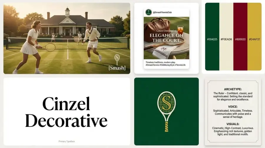
Copy this prompt:
Act as a lead brand designer creating a comprehensive Brand Identity System presentation for [BRAND NAME], a company in the [INDUSTRY] category.

Create one high-resolution bento-grid presentation board with six clearly separated modules. First determine a suitable brand archetype, visual direction, four-color palette, and one specific Google Font that fits the industry.

Module 1 — Hero Key Visual:
A high-end commercial photograph showing the product or service in context. Use cinematic but believable lighting. Place the supplied [BRAND NAME] logo in white over the image. If a logo reference is uploaded, preserve its geometry exactly.

Module 2 — Social Post:
A realistic social-media post mockup with one lifestyle image and the exact headline “[HEADLINE].” Use the selected brand font. Do not add platform UI.

Module 3 — Color Palette:
Four vertical color swatches. Display one legible HEX code inside or below each swatch. Use four distinct colors that work together and match the visual direction.

Module 4 — Typography:
A minimalist type specimen showing only the selected font name in large, crisp lettering. Do not show “Aa,” an alphabet, or a paragraph sample. Add the small caption “Primary Typeface.”

Module 5 — Logo:
A solid-color block containing the final logo in a clean vector-like treatment. No construction grid, measurements, or alternate sketches.

Module 6 — Brand DNA:
A concise manifesto card with three short labeled entries:
ARCHETYPE: [ARCHETYPE]
VOICE: [VOICE TRAITS]
VISUALS: [VISUAL TRAITS]

Overall finish: clean gap-separated grid, disciplined alignment, generous spacing, soft studio lighting across the whole board, sharp typography, vector-like graphic elements mixed with commercial photography, 4K or the highest available resolution. No watermark. Do not add modules beyond the six listed above.
Change these details: [BRAND NAME], [INDUSTRY], [HEADLINE], and any known brand traits. Leave the archetype and palette open only when you genuinely want the model to explore.
Why it works: Each module has one job. The fixed six-block structure reduces the chance of receiving an attractive collage that lacks practical brand-system information.
If the text is inaccurate:
Preserve the six-module grid, photography, palette, logo, and spacing. Replace only the visible text with the following exact copy: [PASTE FINAL COPY]. Do not paraphrase, add, or repeat any words.
3. Grilled-Cheese Action Photograph
Best for: Food ads, thumbnails, menu campaigns, and sensory close-ups
Reference image: Not required
Recommended ratio: 4:5
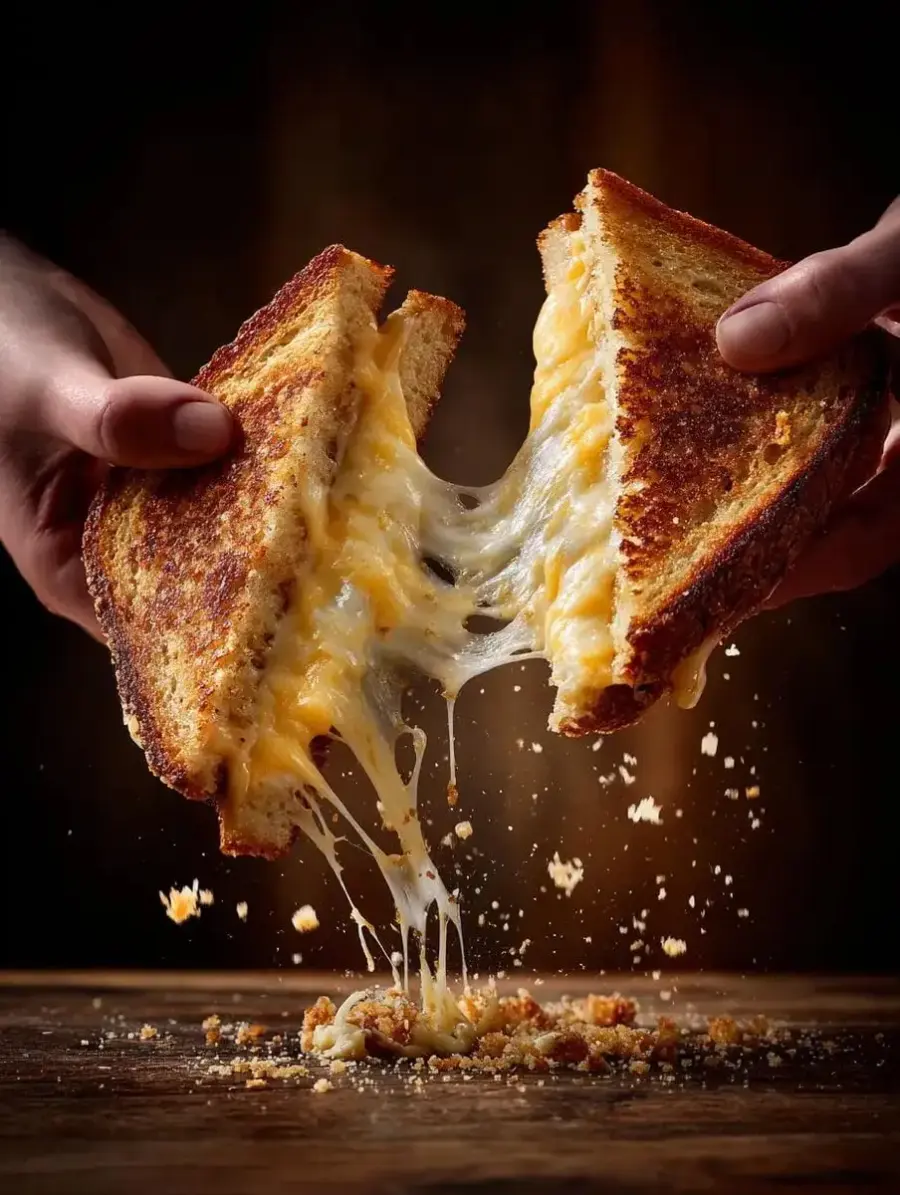
Copy this prompt:
Create a cinematic commercial food photograph of two natural human hands pulling apart a freshly grilled [SANDWICH TYPE]. Capture long strands of melted [CHEESE TYPE] stretching dramatically between the two halves. The toasted bread edges are crisp and golden, with a few crumbs frozen in mid-air.

Composition: tight close-up, sandwich centered, hands entering naturally from the left and right edges, cheese pull forming the main visual line.
Lighting: warm directional restaurant light with soft fill, rich highlights on the melted cheese, deep but realistic background falloff.
Camera: high-speed food-action photography, shallow depth of field, sharp focus on the cheese strands and toasted surface.
Materials: crisp bread texture, glossy melted cheese, subtle steam, natural skin texture.
Background: dark, warm, uncluttered kitchen or dining environment.
Output: premium food-advertising photograph, 4K or the highest available resolution. No text, logo, watermark, extra hands, or extra sandwich pieces.
Change these details: [SANDWICH TYPE], [CHEESE TYPE], background mood, and brand color if this belongs to a campaign.
Why it works: The action, focal point, hand placement, and lighting are explicit. The model has fewer opportunities to place the hands awkwardly or turn the cheese pull into an undefined blur.
If the hands or cheese look wrong:
Keep the framing, bread, lighting, background, and cheese-pull length unchanged. Correct only the hands and cheese: show exactly two anatomically natural hands with five fingers each, holding one sandwich half per hand, with continuous melted-cheese strands connecting the two halves.
4. Technical Product Infographic for a Snack
Best for: Packaging explainers, product-development presentations, launch posts, and food-engineering content
Reference image: Recommended for exact packaging and product structure
Recommended ratio: 1:1
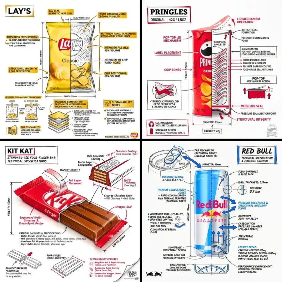
Copy this prompt:
Use the uploaded [SNACK OR PACKAGING] image as the exact product reference. Create a branded technical infographic that combines a realistic product photograph or photorealistic render with technical annotation overlays placed directly around and over the product.

Use a pure white studio background. Draw the annotations in black ink with restrained [BRAND COLOR] accents, similar to an architectural sketch. Include only information supplied below:


- Key component labels: [COMPONENT LABELS]

- Internal cross-section: [LAYER OR STRUCTURE DESCRIPTION]

- Measurements and dimensions: [VERIFIED DIMENSIONS]

- Material or ingredient callouts: [VERIFIED MATERIALS OR INGREDIENTS]

- Functional arrows: [FEATURE AND FUNCTION NOTES]

- Sustainability callouts: [VERIFIED SUSTAINABILITY CLAIMS]

Add one simple sectional or schematic diagram that explains the product's internal structure. Place the product name “[PRODUCT NAME]” inside a hand-drawn technical title box with a [BRAND COLOR] border in the upper corner.

Style rules:

- Keep the realistic product fully recognizable and unobstructed.

- Use black for roughly 70–80% of the technical linework and [BRAND COLOR] for the remaining highlights.

- Maintain balanced negative space and clear label hierarchy.

- Use precise but slightly hand-drawn lines.

- Place the supplied brand mark subtly in one corner; do not redesign it.

Output: 1080 × 1080 square composition, crisp labels, premium food-engineering presentation, no watermark. Do not invent measurements, ingredients, certifications, or environmental claims.
Change these details: [SNACK OR PACKAGING], [BRAND COLOR], [PRODUCT NAME], and every verified technical field.
Why it works: This prompt ties each annotation to supplied facts. That matters because a visually convincing infographic can still be commercially unusable if the model invents a dimension or sustainability claim.
If the product or facts change:
Keep the product photograph, white background, title position, annotation style, and color ratio unchanged. Correct only the product geometry and annotation copy to match the uploaded reference and this verified fact list: [PASTE FACT LIST]. Delete any unsupported claim.
5. Real Portrait with Matching Chibi Miniatures
Best for: Personal posters, creator visuals, profile art, and playful character campaigns
Reference image: Required for a recognizable person
Recommended ratio: 2:3
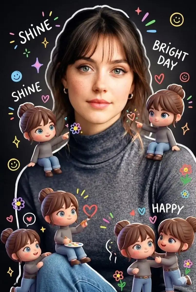
Copy this prompt:
Use the uploaded portrait as the identity reference for the main subject. Preserve the subject's facial features, hairstyle, skin tone, body proportions, expression, outfit, accessories, and overall age appearance.

Create a realistic full or three-quarter portrait of the same person. Surround the main subject with several cute 3D-style chibi miniatures based on that same identity. Every miniature must share the same recognizable facial features, hairstyle, outfit colors, and signature accessories, while using simplified chibi body proportions.

Distribute the miniatures naturally around the subject. Let them interact playfully with the clothing, shoulders, nearby props, or frame edges without covering the subject's face.

Add restrained hand-drawn doodles: soft white outlines around the main subject, small sparkles, hearts, tiny flowers, and smiley icons. Include only these short handwritten phrases: “shine,” “bright day,” and “happy.”

Visual treatment: realistic portrait photography combined with soft, colorful cartoon elements. Keep the main subject photographic and the miniatures clearly stylized. Use a clean dark or softly blurred background so the small figures remain readable.

Output: vertical 2:3 composition, high facial detail, natural anatomy, no watermark. Do not change the main subject's face, body shape, outfit, or proportions. Do not add unrelated people.
Change these details: Doodle phrases, background color, outfit, and the miniature interactions. Keep the identity-preservation sentence intact.
Why it works: The prompt assigns two different visual roles to the same identity: photographic for the main subject and stylized for the miniatures. Without that separation, the model may cartoonize the whole portrait.
If the face changes:
Keep the composition, chibi figures, doodles, outfit, and background unchanged. Restore only the main subject's face and hairstyle to match the uploaded reference exactly. Do not beautify, age, or restyle the face.
6. 30-Second ASMR Unboxing Storyboard
Best for: Commercial pre-production, creative pitches, shot planning, and UGC-style product videos
Reference image: Recommended for exact packaging and product identity
Recommended ratio: 16:9
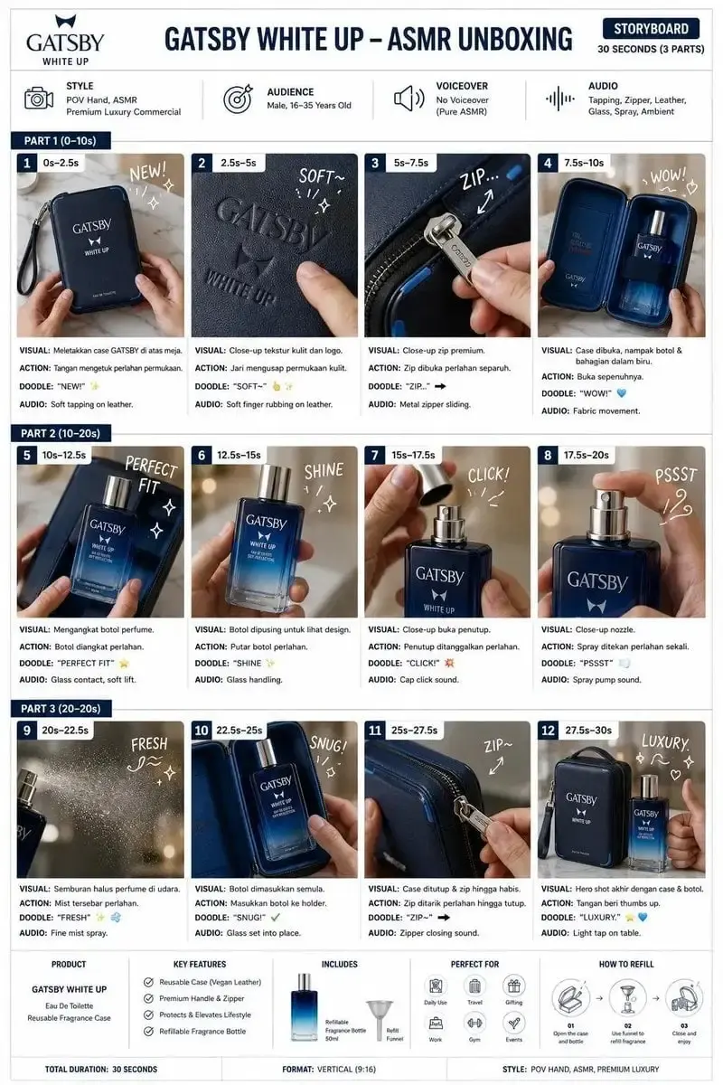
Copy this prompt:
Create a professional advertising-agency storyboard for a 30-second luxury ASMR unboxing commercial for [PRODUCT NAME], a [PRODUCT CATEGORY]. Use the uploaded product and packaging images as exact visual references.

Presentation board:

- Clean white background

- Modern editorial layout

- [PRIMARY BRAND COLOR], black, and gray typography

- Thin dividers and consistent margins

- 12 numbered frames arranged in 3 rows × 4 columns

- Timestamps grouped into Part 1 (0–10s), Part 2 (10–20s), and Part 3 (20–30s)

Top section:
Title: “[PRODUCT NAME] — ASMR UNBOXING”
Subtitle: “Storyboard: 30 Seconds (3 Parts)”
Four compact information cards:

1. Style: POV hands, ASMR, premium product commercial

2. Audience: [TARGET AUDIENCE]

3. Voiceover: None — pure ASMR

4. Audio: [AUDIO CUES]

Each frame must contain:

- A consistent product or packaging image

- Frame number and timestamp

- One short handwritten sound or reaction cue

- Three short captions labeled Visual, Action, and Audio

Frame sequence:

1. Package placed on table

2. Exterior material close-up

3. Seal, zipper, or lid opening

4. Interior reveal

5. Product removed

6. Product beauty shot

7. Cap or protective cover removed

8. Product activated or used

9. Sensory detail close-up

10. Product returned to package

11. Package closed

12. Final hero shot with product and packaging

Bottom section:

- Product summary

- Three verified key features

- Box contents

- Best-use occasions

- Three-step usage or refill diagram

Use only the exact product name, features, contents, and claims supplied here: [VERIFIED PRODUCT COPY]. Keep the product, logo, packaging colors, and proportions consistent across all 12 frames. Output a sharp 4K presentation board with legible text and no watermark.
Change these details: [PRODUCT NAME], [PRODUCT CATEGORY], [TARGET AUDIENCE], [AUDIO CUES], brand colors, and verified product copy.
Why it works: A storyboard needs order, not just visual style. The numbered sequence, repeated caption system, and consistent product reference make the output useful for planning a real 30-second shoot.
If the frame order or product changes:
Preserve the 3 × 4 board, typography, colors, and all existing captions. Correct only the frame sequence and product appearance. Use the uploaded product as the exact reference in every frame, and follow this numbered shot order without omissions: [PASTE FINAL SHOT LIST].
Nano Banana Pro Prompts for Branding, Ads, and Social Graphics
7. Geographic Map with a 3D City Diorama
Best for: Destination marketing, education, editorial maps, and location explainers
Reference image: Optional; helpful for less familiar cities or exact boundaries
Recommended ratio: 1:1
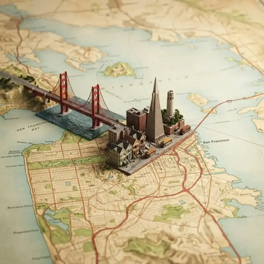
Copy this prompt:
Create a realistic overhead geographic map of [COUNTRY OR REGION], centered on the area containing [CITY]. Use geographically plausible coastlines, rivers, terrain, and regional boundaries. Mark [CITY]'s real location accurately.

At that location, raise a miniature 3D diorama of [CITY] directly from the map surface. Include a curated set of recognizable architecture, natural landmarks, transportation, and cultural details: [LANDMARK 1], [LANDMARK 2], [LANDMARK 3], [NATURAL FEATURE], and [CULTURAL ELEMENT]. Keep the miniature compact enough that the surrounding map remains readable.

Visual treatment: premium macro photography of a physical map model, realistic paper and terrain textures, fine architectural materials, controlled depth of field, soft studio lighting, and subtle contact shadows where the city rises from the map.

Composition: square 1:1, map viewed from a high three-quarter or near-overhead angle, city placed at the correct geographic point, no unrelated landmarks, no duplicated buildings.
Output: high-detail 4K image or the highest available resolution. Add only the labels “[COUNTRY OR REGION]” and “[CITY]” if requested. No watermark.
Change these details: [COUNTRY OR REGION], [CITY], and the verified landmarks and cultural elements.
Why it works: The prompt separates geographic context from the miniature city. It also asks for a curated landmark set, which is safer than letting the model fill the diorama with generic buildings.
If the location or landmarks are wrong:
Keep the map style, camera angle, lighting, diorama scale, and material textures unchanged. Move the diorama to the correct location of [CITY] and replace the inaccurate structures with only these landmarks: [VERIFIED LANDMARK LIST].
8. Sophisticated Muted Brand Campaign Grid
Best for: Sports, fashion, automotive, and lifestyle campaign concepts
Reference image: Recommended for exact products, athletes, or brand marks
Recommended ratio: 4:5 or 1:1
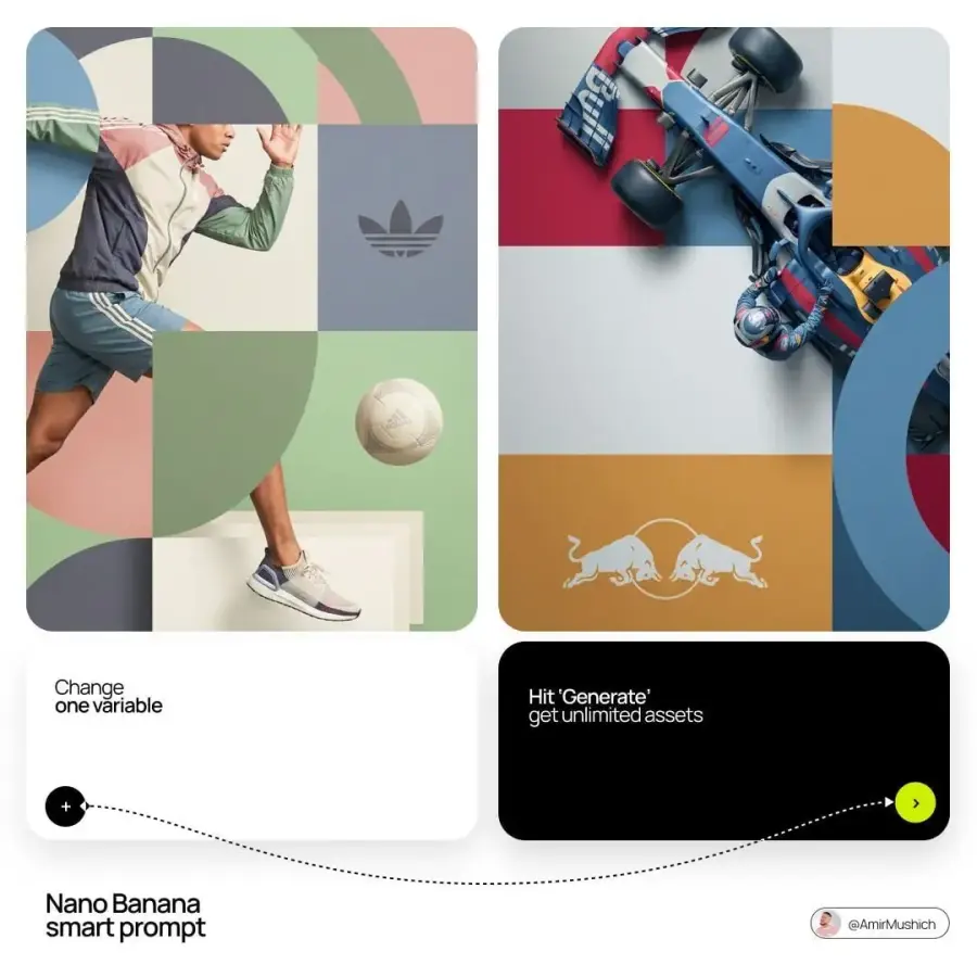
Copy this prompt:
Act as an editorial campaign designer for [BRAND NAME]. Use the uploaded logo, product, and subject references as the exact source assets.

Create a clean 2 × 2 grid composition. Place one main photographed subject — [PERSON, VEHICLE, OR PRODUCT] — across the grid using a layered “sandwich” effect: some parts pass behind geometric blocks while selected edges, limbs, wheels, or props overlap the blocks to create depth.

Add large geometric arcs and circles across the grid. Place one recognizable brand-related prop, [PROP], in a separate quadrant to balance the subject.

Color direction:

- Identify the core colors of [BRAND NAME].

- Shift them into a sophisticated muted palette using dusty, earthy, desaturated versions.

- Use matte flat-color blocks with no gradients.

- Avoid neon and oversaturated tones.

Photography:

- High-end commercial studio image

- Soft diffused lighting with gentle highlights

- No harsh shadows

- Subject should appear physically integrated with the grid rather than pasted on top

Branding:

- Place the supplied [BRAND NAME] logo in one block as a clean single-color mark.

- Preserve the logo shape and spacing exactly.

- Do not add a tagline or redesign the symbol.

Output: disciplined editorial composition, controlled overlaps, sharp subject detail, generous spacing, 4K or the highest available resolution. No watermark or extra text.
Change these details: [BRAND NAME], [PERSON, VEHICLE, OR PRODUCT], [PROP], and the uploaded reference assets.
Why it works: The layering instructions describe how the subject should interact with the grid. That is more useful than simply asking for an “editorial collage,” which often produces four disconnected tiles.
If the result feels flat:
Keep the subject identity, brand palette, logo, 2 × 2 grid, and lighting unchanged. Adjust only the layer order: hide selected parts of the subject behind two geometric blocks, then let [SPECIFIC LIMB / WHEEL / PROP] overlap the foreground block to create clear depth.
9. Expressionist Linocut Portrait with a Cat
Best for: Art prints, book covers, posters, and editorial illustration
Reference image: Not required; optional for a specific face
Recommended ratio: 9:16
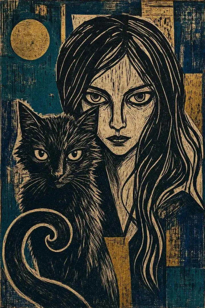
Copy this prompt:
Create a dramatic Expressionist linocut print on raw, ink-textured paper. A young woman sits in a calm three-quarter portrait with her eyes closed. A black cat curls protectively around the back of her neck, its body forming a sweeping crescent of bold carved lines.

Intertwine the woman's hair with the cat's fur so they read as one unified dark mass. Keep the woman's face and the cat's head clearly distinguishable. Use aggressive carved strokes, visible ink gaps, uneven pressure, and chiseled wood-grain marks.

Background: dense high-contrast block-print texture built from layered deep teal ink and restrained stamped metallic-gold blocks. Arrange the carved marks into a rough halo around the woman's head.

Style: primitive, forceful, graphic, and handmade. Preserve the limitations of a physical linocut print — flat ink areas, rough edges, carved negative space, and imperfect registration.

Composition: vertical 9:16, centered portrait, no text, no photorealism, no smooth digital gradients, no extra tails, limbs, faces, or animals. High-resolution print detail, no watermark.
Change these details: Ink colors, subject age, expression, animal, or orientation. Keep the printmaking constraints if you want a convincing linocut result.
Why it works: The prompt describes the physical logic of linocut — carved negative space, uneven ink, flat layers, and rough registration — instead of relying on the style name alone.
If it becomes too photographic:
Keep the woman, cat, pose, teal-and-gold palette, and vertical composition unchanged. Convert only the rendering into a true two-layer linocut: flat ink shapes, carved white gaps, rough wood-grain marks, uneven edges, and no realistic skin, fur, gradients, or camera lighting.
10. Waterfront City Cross-Section Diorama
Best for: Educational posters, urban storytelling, museum-style visuals, and city content
Reference image: Optional; recommended for geographic or engineering accuracy
Recommended ratio: 1:1
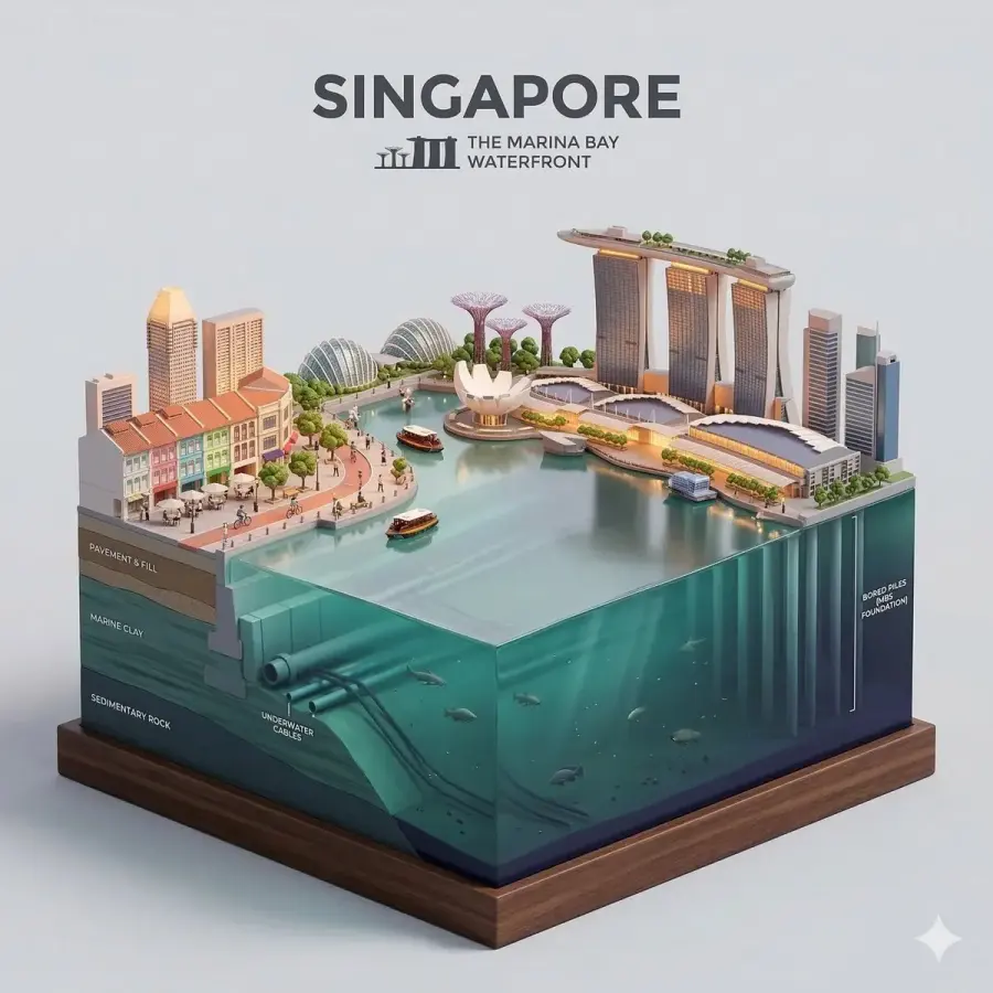
Copy this prompt:
Create a clear side-facing isometric miniature 3D diorama of [CITY] along [WATERFRONT NAME]. Present the city as a clean vertical cross-section specimen mounted on a small raised museum-style base. The cutaway must reveal the full structure from rooftops to riverbed or seabed.

Above the waterline:

- A curated selection of [CITY]'s recognizable waterfront architecture

- [LANDMARKS OR BRIDGES]

- Embankment promenade and local transportation

- Tiny stylized residents walking, cycling, or sitting at waterfront cafés, with no facial detail

- Warm amber and golden ambient light

Waterline:

- One clean, glassy horizontal band

- Slight transparency

- Clear boundary between the upper city and underwater environment

Below the waterline:

- Foundation and piling types appropriate to [CITY]

- Verified underwater infrastructure: [INFRASTRUCTURE]

- Sediment and substrate layers appropriate to [BODY OF WATER]

- Local aquatic life: [SPECIES]

- Slow particles and refracted light shafts

Cut edge:
Show pavement layers, foundations, soil strata, underwater geology, and the riverbed or seabed in one razor-clean section wall. Keep the structure educational and readable rather than chaotic.

Visual style: refined 3D cartoon diorama with realistic PBR-like materials, soft textures, and controlled ambient lighting. Use warm tones above the water and cold teal-green to deep indigo below, blending only at the waterline.

Use a solid [BACKGROUND COLOR] background. At the top center, display “[CITY]” in large bold text with “[WATERFRONT NAME]” below it. Automatically use light or dark typography for sufficient contrast.

Output: centered 1080 × 1080 square composition, no watermark. Do not invent engineering details when verified information is supplied.
Change these details: [CITY], [WATERFRONT NAME], landmarks, underwater infrastructure, local species, and background color.
Why it works: The prompt uses the waterline as a structural divider and assigns different information to the three zones. That makes the cross-section easier to read than a generic floating-city diorama.
If the cutaway is confusing:
Preserve the city landmarks, square composition, color transition, and museum-diorama style. Correct only the cross-section geometry so the rooftops, street layer, foundations, soil strata, waterline, underwater infrastructure, sediment, and riverbed appear in one continuous vertical slice.
11. Pastel Skincare Social Ad
Best for: Beauty launches, product posts, paid-social concepts, and ecommerce campaigns
Reference image: Recommended for exact bottle, label, and logo
Recommended ratio: 4:5 or 9:16
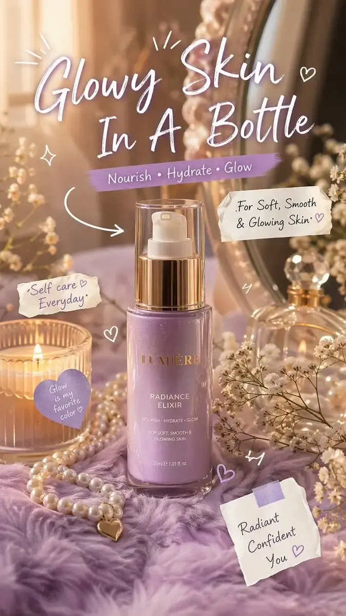
Copy this prompt:
Use the uploaded [SKINCARE PRODUCT] image as the exact product and label reference. Create a luxury skincare advertisement on a soft [PASTEL COLOR] background with warm golden sunlight and a dreamy but readable editorial finish.

Place the product upright on a cozy [SURFACE MATERIAL AND COLOR] vanity surface. Arrange a mirror, pearls, one candle, and small baby's-breath flowers around it. Keep the product as the largest and sharpest element. Add a subtle glossy reflection and soft natural shadows, with a lightly blurred background.

Add restrained hand-drawn doodles in white and [ACCENT COLOR]: small arrows, sparkles, hearts, and two tiny note stickers. Do not cover the product name or logo.

Use this exact text and no other marketing copy:
Headline: “[HEADLINE]”
Benefit line: “[BENEFIT 1] • [BENEFIT 2] • [BENEFIT 3]”
Support line: “[SUPPORTING CLAIM]”
Small note: “[SHORT SELF-CARE LINE]”

Typography: large handwritten headline, clean sans-serif supporting text, clear hierarchy, correct spelling, sufficient contrast.

Composition: premium beauty-campaign image suitable for Instagram, TikTok, and X, but without social-platform UI. Output vertical 4:5 or 9:16, 4K or the highest available resolution, no watermark. Preserve the uploaded packaging, product proportions, label, cap, and logo. Use only verified benefit claims.
Change these details: Product reference, pastel and accent colors, surface, and all exact copy fields.
Why it works: The prompt gives the decorative elements a supporting role and reserves sharp focus for the bottle. Exact copy fields also reduce the chance of receiving several competing taglines.
If the label or headline is wrong:
Keep the product position, props, lighting, doodles, colors, and framing unchanged. Restore the bottle the label from the uploaded reference and replace only the campaign text with: “[PASTE EXACT FINAL COPY].” Do not add any other words.
12. Consistent Hairstyle Comparison Grid
Best for: Salon consultations, character development, grooming content, and style previews
Reference image: Required to preserve one person's identity
Recommended ratio: 1:1
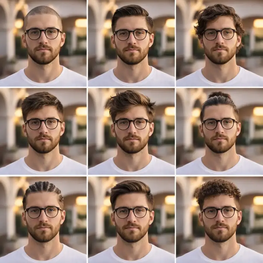
Copy this prompt:
Use the uploaded portrait as the exact identity reference. Create a clean 3 × 3 portrait collage showing the same young man with nine different hairstyles. Preserve the same facial structure, skin tone, eye color, beard or stubble, apparent age, expression, camera angle, pose, clothing, background, and lighting in every tile. Change only the hairstyle.

Subject:

- Young adult man

- Medium skin tone with natural texture

- Sharp jawline and well-groomed beard stubble

- Neutral, confident expression

- Plain fitted white T-shirt

Hairstyles, one per tile in this exact order:

1. Clean buzz cut

2. Classic slicked-back hair

3. Medium-length wavy hair

4. Short textured fringe

5. Voluminous messy style

6. Man bun

7. Cornrow braids

8. Modern side-swept fade

9. Tight curly textured cut

Environment:

- Outdoor courtyard with white architectural arches

- Soft sunset or golden-hour light

- Clean, softly blurred background

Camera:

- Shoulder-level portrait

- Eye-level angle

- 50mm lens look

- Identical crop and head size in all nine tiles

Output: square 3 × 3 grid, thin even gutters, no text, no watermark. Do not change the face, facial hair, body, wardrobe, camera, or environment between tiles.
Change these details: The nine hairstyle names, wardrobe, setting, and light. Do not weaken the “change only the hairstyle” instruction.
Why it works: It locks every variable except hair. That single-variable approach is the main reason comparison grids stay useful rather than becoming nine loosely related portraits.
If the identity changes across tiles:
Keep the nine hairstyles, grid, wardrobe, background, crop, and lighting unchanged. Correct only identity consistency: every tile must show the exact same person from the uploaded reference, with identical facial structure, skin tone, eyes, beard, age, expression, and head angle.
13. Interior Design Mood Board from a Room Reference
Best for: Interior proposals, renovation concepts, material planning, and client presentations
Reference image: Required
Recommended ratio: 3:4
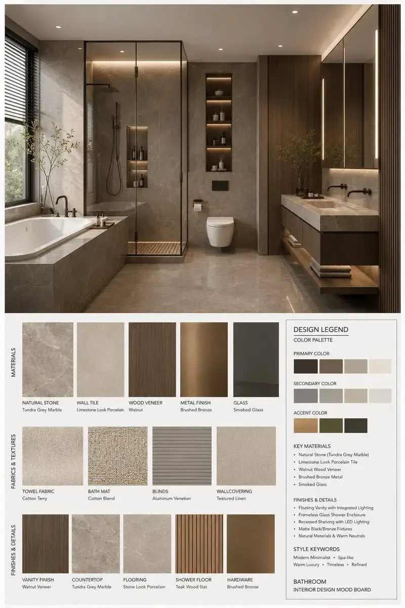
Copy this prompt:
Act as a professional interior-design mood-board creator. Use the uploaded [SPACE TYPE] photograph as the primary spatial reference. Create a vertical 3:4 high-end interior-design presentation board that expresses [STYLE NAME] through [STYLE KEYWORDS], supports a [MOOD KEYWORDS] atmosphere, and matches a [BRANDING TONE] presentation style.

Upper section — Interior visualization:
Create one high-resolution photorealistic view of the [SPACE TYPE]. Preserve the uploaded room's basic architecture, layout logic, furniture language, material relationships, color balance, and light direction, while refining the scene into a complete design proposal.

Feature these elements:

- Key furniture: [KEY FURNITURE ELEMENTS]

- Materials: [MATERIAL KEYWORDS]

- Color palette: [COLOR PALETTE]

- Lighting: [LIGHTING STYLE]

Lower section — Matching material and furnishing samples:
Display an ordered collection of material boards, fabric swatches, color chips, finish samples, and relevant wood, stone, metal, glass, textile, leather, or paint samples. Every sample must correspond directly to an element visible in the upper room visualization. Do not add random materials that are absent from the design.

Lower-right information panel — Design Legend / Color Palette:

- Primary colors

- Secondary colors

- Accent colors

- Core materials

- Finish descriptions

- Style keywords

Layout and finish:

- Professional interior-design-studio presentation

- Minimal, controlled, and well-spaced grid

- Clear hierarchy and generous white space

- Accurate correspondence between the room and every material sample

- Clean modern labels in [LABEL LANGUAGE]

- [RENDER QUALITY]

- Vertical 3:4 composition

- 4K or the highest available resolution

Board title:
“[SPACE TYPE] Interior Design Mood Board”
Style direction: “[STYLE NAME]”
Keywords: “[STYLE KEYWORDS], [MATERIAL KEYWORDS], [COLOR PALETTE], [MOOD KEYWORDS]”

Avoid a cluttered scrapbook appearance, cheap poster styling, mismatched materials, incorrect perspective, illegible labels, excessive decoration, cartoon rendering, oversaturated colors, weak information hierarchy, or random sample placement. No watermark.
Suggested variables:
[SPACE TYPE]: bedroom, living room, kitchen, study, lobby, bathroom, or dining room
[STYLE NAME]: modern minimalist, wabi-sabi, warm contemporary, Scandinavian natural, mid-century modern, or restrained luxury
[MATERIAL KEYWORDS]: walnut, travertine, linen, wool, brushed metal, microcement, leather, or glass
[LABEL LANGUAGE]: English, bilingual, or another required language
Why it works: The prompt forces the lower material samples to correspond to the room above. That relationship is what separates a useful design board from a decorative collage.
If the material samples do not match:
Keep the upper room, board layout, labels, color palette, and lighting unchanged. Replace only the lower samples so each one corresponds to a visible material in the room. Use this exact mapping: [FURNITURE OR SURFACE] → [MATERIAL / COLOR / FINISH]. Remove every unmatched sample.
14. Double-Exposure Luxury Travel Poster
Best for: Destination campaigns, magazine covers, event posters, and tourism content
Reference image: Optional; recommended for a specific model or exact landmark set
Recommended ratio: 2:3
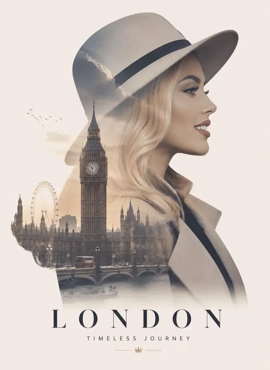
Copy this prompt:
Create a luxury double-exposure travel poster for [CITY NAME]. Show an elegant side-profile portrait of [SUBJECT DESCRIPTION] against a minimalist cream background. Blend the city's skyline and selected landmarks inside the subject's silhouette while keeping the face, jawline, and hair edge readable.

Inside the silhouette, include only:

- [LANDMARK 1]

- [LANDMARK 2]

- [LANDMARK 3]

- [RIVER, COAST, OR NATURAL FEATURE]

- Soft golden-hour reflections

- A few distant birds and light atmospheric mist

Use realistic skin texture, flowing hair, soft golden-hour light, refined cream-and-gold color grading, elegant shadows, and generous negative space. The city elements should feel integrated into the portrait rather than pasted over it.

Typography at the bottom:
Large title: “[CITY NAME]”
Small slogan: “[TRAVEL SLOGAN]”

Typography style: premium travel-magazine cover, clean kerning, correct spelling, high contrast, no extra text.

Output: vertical 2:3 poster, photoreal portrait with controlled double exposure, 4K or the highest available resolution, no watermark. Do not add landmarks from other cities.
Change these details: [CITY NAME], subject description, three verified landmarks, natural feature, and slogan.
Why it works: The prompt limits the landmark set and specifies where the city should appear. Without those controls, double-exposure prompts often produce a skyline floating over the face instead of living inside the silhouette.
If the face or city becomes unclear:
Keep the portrait pose, cream background, typography, landmark list, and color grade unchanged. Refine only the double exposure: preserve a clean facial outline and readable eye, nose, lips, and jaw, while containing all city architecture inside the silhouette.
Nano Banana Pro Prompts for Ecommerce and Performance Ads
15. Maximalist Beverage Product Mockup with Liquid Chaos
Best for: Beverage launches, fruit-drink campaigns, ecommerce ads, social posters, and packaging mockups
Reference image: Strongly recommended for accurate packaging, logo, and label text
Recommended ratio: 4:5
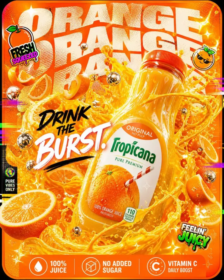
Copy this prompt — Orange Juice Burst:
Use the uploaded Tropicana bottle image as the exact product and packaging reference. Create a 4:5 vertical maximalist product-advertising poster in 4K or the highest available resolution. The core idea is: freshness turned all the way up.

BACKGROUND:

- A blazing-orange rounded rectangle filling most of the frame

- Layered orange-to-gold gradients

- Citrus-rind textures, pulp patterns, and halftone dots

- Dense visual energy without reducing product or text legibility

TYPOGRAPHY:

- Repeat the exact word “ORANGE” three times in huge cream-white uppercase letters

- Warp, stack, crop, and partially mask the three words behind the product

- Use bold display typography with halftone texture and strong contrast

PRODUCT:

- Place one Tropicana orange juice bottle in the extreme foreground

- Tilt the bottle toward the camera with dominant wide-angle perspective

- Preserve the uploaded bottle shape, cap, label layout, logo, colors, fruit image, and readable packaging text

- Keep the bottle sharp, glossy, and clearly separated from the background

MAXIMALIST LIQUID CHAOS:

- Make the bottle appear to burst into thick orange juice waves exploding outward

- Add sliced oranges and whole oranges spinning through several depth layers

- Suspend realistic pulp particles and juice droplets in mid-air

- Twist citrus peels through the composition like ribbons

- Form overlapping juice spirals, arcs, splashes, and glossy liquid sheets around the bottle

- Keep the main logo and product name unobstructed

SUPPORTING ELEMENTS:

- Reflective chrome bubbles

- Small white sparkles ✦

- Glossy liquid reflections and bright specular highlights

- Restrained magenta, purple, and green glitch streaks near the edges

- Two or three sticker-style orange icons

- Layered shadows and foreground-to-background depth

Use only this exact campaign copy:
Center headline: “DRINK THE BURST.”
Bottom feature 1: “100% JUICE”
Bottom feature 2: “NO ADDED SUGAR”
Bottom feature 3: “VITAMIN C”

Place the center headline across the lower-left to center area without covering the bottle label. Put the three features in a clean orange footer strip with simple white icons and dividers.

FEEL:
Bright. Loud. Juicy chaos. Commercially polished rather than messy.

Output: vertical 4:5 campaign poster, 4K or the highest available resolution, crisp product detail, correct typography, no watermark, no duplicate bottle, and no extra marketing copy. Use the feature claims only if they are verified for the referenced product.
Variation A — Full Mango:
Use the uploaded Real Mango bottle image as the exact product and packaging reference. Create a 4:5 vertical maximalist beverage poster in 4K or the highest available resolution. The core idea is: mango energy overflowing.

Build the background from a deep mango-yellow-to-orange gradient block, layered with paint splashes, organic fruit textures, pulp patterns, and irregular glossy shapes. Place the word “MANGO” in huge, thick, stretched uppercase typography, repeating and layering it behind the bottle.

Place one Real Mango bottle forward-facing in the center foreground. Preserve the supplied bottle shape, cap, logo, label, colors, proportions, and readable packaging text.

Make mango pulp explode outward from the bottle opening. Surround it with whole mangoes and sliced mango cheeks rotating across several depth layers. Turn thick mango juice drips into rolling waves and let part of the splash expand into dense clouds of mango texture. Add liquid blobs, dripping textures, glossy highlights, and controlled chaotic overlap while keeping the bottle label readable.

Use only this exact campaign copy:
Center headline: “GO FULL MANGO.”
Bottom feature 1: “REAL FRUIT”
Bottom feature 2: “THICK & RICH”
Bottom feature 3: “NO PRESERVATIVES”

The final feeling should be rich, dense, indulgent chaos. Output vertical 4:5, 4K or the highest available resolution, correct typography, no watermark, no duplicate bottle, and no additional copy. Use product claims only when verified for the referenced bottle.
Variation B — Multi-Fruit Collision:
Use the uploaded Minute Maid bottle image as the exact product and packaging reference. Create a 4:5 vertical maximalist multi-fruit campaign poster in 4K or the highest available resolution. The core idea is: all fruits collide in one drink.

Construct the background from overlapping red, yellow, and green color blocks with gradient overlays, halftone textures, chromatic edges, and layered shadows. Repeat the exact word “FRUIT” in large stacked uppercase letters, using overlapping colors behind the product.

Place one Minute Maid bottle at the center, tilted slightly toward the camera. Preserve the uploaded bottle shape, cap, label, logo, colors, proportions, and readable packaging text.

Create an explosive collision of apples, oranges, and grapes around the bottle. Show whole fruit and cut slices suspended in several depth layers. Cross red, orange, yellow, and green juice streams through one another without muddying their colors. Add multi-color droplets, particle bursts, small fruit fragments, restrained chromatic glitch, and realistic splash reflections. Keep the product logo visible.

Use only this exact campaign copy:
Center headline: “MIX IT ALL.”
Bottom feature 1: “MULTI FRUIT”
Bottom feature 2: “REFRESHING TASTE”
Bottom feature 3: “DAILY BOOST”

The final feeling should be colorful, energetic, and layered. Output vertical 4:5, 4K or the highest available resolution, correct typography, no watermark, no duplicate bottle, and no additional copy. Use product claims only when verified for the referenced bottle.
Variation C — Paper Boat Memory Burst:
Use the uploaded Paper Boat pouch image as the exact product and packaging reference. Create a 4:5 vertical maximalist beverage poster in 4K or the highest available resolution. The core idea is: nostalgia exploding into the present.

Build the background from layered muted pastels and nostalgic summer tones, with paper grain, scrapbook textures, hand-drawn scribbles, translucent paper, and torn edges. Combine handwritten lettering with bold display typography. Repeat or layer the exact word “MEMORY” behind the product while preserving a clear reading hierarchy.

Place one Paper Boat pouch forward-facing in the center foreground. Preserve the supplied pouch shape, material, logo, illustration, colors, proportions, and readable packaging text.

Make childhood memories burst from the pouch: paper kites, folded paper boats, mango slices, small summer-scene fragments, and warm sunlight. Let the juice flow outward like winding memory streams. Arrange the objects as overlapping scrapbook layers rather than one literal landscape.

Add paper cutouts, doodles, grain, soft glow overlays, translucent tape, gentle shadows, and tactile handmade edges. Keep the product and campaign headline clearly readable.

Use only this exact campaign copy:
Center headline: “TASTE YOUR CHILDHOOD.”
Bottom feature 1: “TRADITIONAL RECIPES”
Bottom feature 2: “NATURAL TASTE”
Bottom feature 3: “NO PRESERVATIVES”

The final feeling should combine emotional maximalism with layered storytelling. Output vertical 4:5, 4K or the highest available resolution, correct typography, no watermark, no duplicate pouch, and no additional copy. Use product claims only when verified for the referenced product.
Change these details: Product reference, brand name, fruit type, background palette, repeated typography, campaign headline, bottom features, and supporting objects. For your own beverage, replace the real-brand names and claims with approved brand assets and verified copy.
Why it works: The prompt separates the visual hierarchy into background typography, dominant product, liquid explosion, supporting particles, and a controlled feature strip. The result can feel intentionally chaotic while the bottle and campaign message remain readable. The three variations show how the same framework can shift from freshness to indulgence, multi-flavor energy, or nostalgic storytelling.
If the packaging or composition drifts:
Keep the fruit explosion, liquid waves, typography, colors, headline, footer, and 4:5 framing unchanged. Correct only the product: restore one bottle or pouch that matches the uploaded reference exactly, including its silhouette, cap or closure, material, logo, label layout, colors, proportions, and all readable text. Keep the product in the dominant foreground position and remove any duplicate packaging.
16. Split-Payment App Performance Ad
Best for: Fintech concepts, app-install ads, paid-social mockups, and UI-led campaigns
Reference image: Recommended for the exact logo and verified app interface
Recommended ratio: 4:5
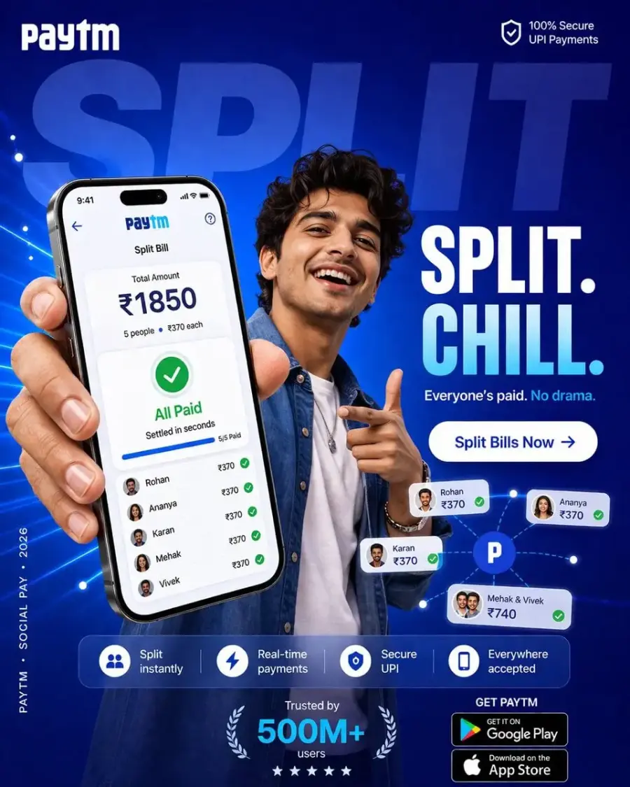
Copy this prompt:
Create a vertical 4:5 paid-social performance ad for [APP NAME], focused on the [SPLIT BILL] feature. Use the uploaded logo and approved interface screenshots as exact brand references. The campaign idea is: payments between friends should feel quick, natural, and low-pressure.

Campaign objective: increase app installs and usage of [FEATURE NAME] among [TARGET AUDIENCE].

Background:

- Large rounded rectangle in [PRIMARY BRAND COLOR]

- Soft radial light behind the subject and phone

- Oversized cropped word “[BACKGROUND WORD]” behind the subject at approximately 12% opacity

- No unapproved gradients if the brand system uses flat color

Subject:

- [SUBJECT DESCRIPTION]

- Casual contemporary outfit in [OUTFIT COLORS]

- Leaning slightly toward the camera

- Holding a phone toward the viewer with mild wide-angle perspective

- Other hand making a natural social gesture

- Genuine laugh or smile

- Realistic skin texture and anatomically natural hands

Phone and interface:

- Phone is the main focal point in the foreground

- Reproduce the uploaded approved UI rather than inventing a new interface

- Screen title: “[FEATURE NAME]”

- Total: “[TOTAL AMOUNT]”

- Breakdown: “[NUMBER OF PEOPLE] people — [AMOUNT PER PERSON] each”

- Status: “[PAYMENT STATUS]”

- Supporting line: “[STATUS SUPPORT LINE]”

- Use green confirmation marks only for completed payments

Graphic system:

- Small floating dots in [SECONDARY BRAND COLOR] and white

- Thin connector lines suggesting a friend group

- Two or three rounded UI cards

- Restrained glow around the phone

Campaign copy:
Headline: “[HEADLINE]”
Subline: “[SUBLINE]”
CTA button: “[CTA TEXT]”
Feature strip: “[FEATURE 1]” · “[FEATURE 2]” · “[FEATURE 3]”
Verified social proof: “[APPROVED TRUST STATEMENT]”

Composition and lighting:

- Eye path: face → phone → payment status → headline → CTA

- 35mm slight wide-angle camera look

- Soft studio light mixed with subtle environmental ambience

- Small interface glow reflected on the fingers

- Sharp subject and phone with a quiet background

Output: vertical 4:5, 4K or the highest available resolution, crisp legible copy, believable UI, no watermark. Use only approved brand assets, verified numbers, and supplied claims. Do not imitate another payment brand, invent an app-store badge, or mix brand names.
Change these details: App name, logo, approved UI screenshot, amounts, audience, brand colors, copy, and verified social proof.
Why it works: The phone shows the product outcome, while the person supplies the emotional hook. More importantly, the prompt removes the brand conflict in the source version and prevents unsupported user-count claims.
If the UI or logo is wrong:
Keep the person, pose, lighting, background, headline, and composition unchanged. Replace only the phone screen and logo with the uploaded approved assets. Preserve their colors, spacing, typography, icon positions, amounts, and wording exactly. Remove every element associated with another brand.
17. Structured JSON Portrait Prompt
Best for: Recreating a portrait setup, controlled character assets, and repeatable art direction
Reference image: Recommended; required if “same face” is important
Recommended ratio: 2:3 or 4:5
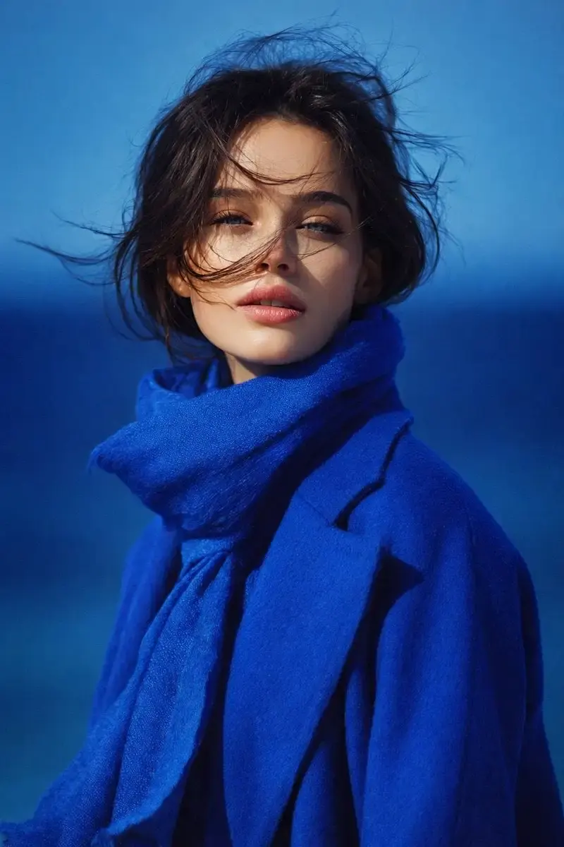
Copy this prompt:
{
  "task": "Create a photorealistic portrait using the uploaded image as the identity and composition reference.",
  "image_type": "portrait photography",
  "resolution_target": "4K or highest available resolution",
  "aspect_ratio": "vertical 2:3",
  "frame_composition": {
    "crop": "mid-chest to head",
    "subject_position": "centered",
    "camera_angle": "eye-level",
    "perspective": "straight-on"
  },
  "subject": {
    "gender_presentation": "female",
    "age_appearance": "young adult",
    "face": {
      "shape": "oval",
      "skin_tone": "fair with a neutral undertone",
      "skin_texture": "natural and detailed, without heavy retouching",
      "eyes": "light blue-green, almond-shaped, looking directly at camera",
      "eyebrows": "dark brown, medium thickness, soft natural arch",
      "nose": "straight and proportionate",
      "lips": "soft natural pink, medium fullness, slightly parted",
      "expression": "calm, neutral, and composed"
    },
    "hair": {
      "color": "dark brown",
      "length": "short to medium",
      "style": "loose and slightly wavy",
      "movement": "a few wind-blown strands crossing the face",
      "parting": "natural and unstructured"
    }
  },
  "clothing": {
    "outerwear": "structured but relaxed deep royal-blue wool coat",
    "accessory": "matching royal-blue scarf wrapped loosely around the neck"
  },
  "lighting": {
    "type": "natural light",
    "direction": "frontal with soft side falloff",
    "intensity": "moderate",
    "shadows": "soft",
    "highlights": "subtle on cheekbones and lips"
  },
  "background": {
    "environment": "open outdoor setting",
    "elements": "blurred horizon and blue gradient suggesting sky and distant water",
    "depth_of_field": "shallow"
  },
  "color_palette": {
    "dominant_colors": ["royal blue", "deep blue", "natural skin tones"],
    "temperature": "cool",
    "contrast": "strong separation between blue clothing and skin"
  },
  "image_style": {
    "realism": "high realism",
    "sharpness": "high facial detail",
    "texture_detail": "visible fabric and natural skin texture",
    "post_processing": "clean color grading with no heavy filter"
  },
  "constraints": [
    "Preserve the uploaded subject's identity and facial structure.",
    "Preserve the reference composition and crop.",
    "Do not change the subject's apparent age.",
    "Do not reshape or beautify the face.",
    "Do not add text, jewelry, extra people, or a watermark."
  ]
}
Change these details: Face, hair, clothing, palette, background, and aspect ratio. If you do not upload a reference image, remove the identity-preservation constraints.
Why it works: JSON does not give the model special hidden control, but it does force the human writer to separate composition, subject, light, wardrobe, and constraints. That organization makes later edits easier.
If the portrait looks over-retouched:
Keep the identity, pose, crop, blue wardrobe, windblown hair, background, and lighting unchanged. Correct only the skin and facial rendering: restore natural pores, fine lines, subtle asymmetry, realistic lip texture, and restrained color grading. Do not reshape the face.
18. Multi-Panel Hobby Guide Poster
Best for: Social explainers, course promotions, hobby communities, and educational wallpaper
Reference image: Optional; upload equipment references when accuracy matters
Recommended ratio: 9:16
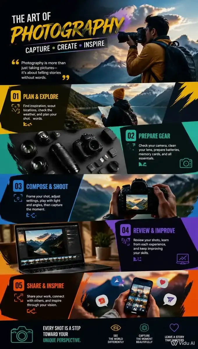
Copy this prompt:
Create a vertical 9:16 editorial guide poster about [HOBBY NAME]. The poster should look as if it were designed by a professional information designer for [TARGET AUDIENCE], with an energetic but ordered visual system.

Title: “[POSTER TITLE]”
Subtitle: “[SHORT PROMISE OR DESCRIPTION]”

Divide the poster into [5–7] clearly separated activity panels. Each panel must show one distinct action from the hobby, using a realistic or stylized scene plus a short exact label:

1. [ACTIVITY 1] — “[LABEL 1]”

2. [ACTIVITY 2] — “[LABEL 2]”

3. [ACTIVITY 3] — “[LABEL 3]”

4. [ACTIVITY 4] — “[LABEL 4]”

5. [ACTIVITY 5] — “[LABEL 5]”
[Add panels 6–7 only if needed.]

Include small supporting icons or equipment details relevant to [HOBBY NAME]: [EQUIPMENT LIST]. Use one consistent illustration or photography style across all panels.

Design system:

- [PRIMARY COLOR], [SECONDARY COLOR], and [ACCENT COLOR]

- Strong title hierarchy

- Consistent panel spacing and alignment

- Colored section bands or geometric connectors

- Enough negative space to keep each action readable

- No random decorative elements

Composition: vertical flow from introduction to beginner actions and then more advanced actions. Keep all labels short, legible, and correctly spelled.

Output: polished 9:16 poster, 4K or the highest available resolution, no watermark, no platform UI, no duplicated panels, and no unrelated activities.
Change these details: Hobby, audience, title, five to seven activities, equipment, and three-color system.
Why it works: The source prompt asked for “several activities” but did not define them. Naming the panels and their order turns the request into an information-design task the model can actually lay out.
If the poster becomes cluttered:
Keep the title, activity list, color system, and vertical format unchanged. Simplify only the layout: use one image, one short label, and one supporting icon per panel; align all panels to the same grid; increase white space; remove every decorative element that does not explain an activity.
19. Gen-Z Beverage Campaign Poster
Best for: Beverage launches, social ads, packaging concepts, and fashion-led product campaigns
Reference image: Recommended for exact can and packaging design
Recommended ratio: 4:5
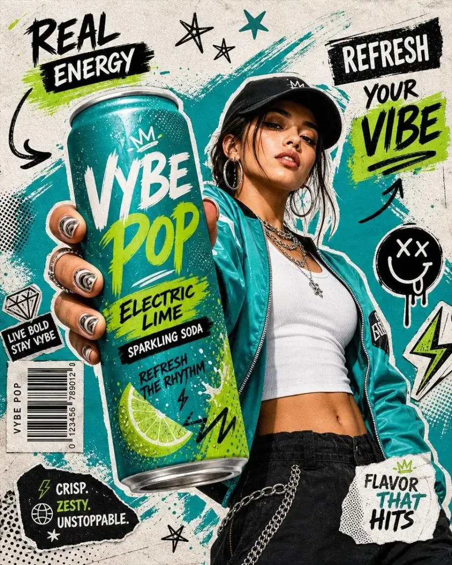
Copy this prompt:
Use the uploaded beverage can as the exact product reference. Create a photorealistic commercial poster with a low-angle wide-lens perspective. Show a confident [MODEL DESCRIPTION] holding one oversized [BEVERAGE NAME] can toward the camera so the can dominates the foreground through controlled forced perspective.

Wardrobe and subject:

- Urban streetwear in [WARDROBE COLORS]

- [ACCESSORIES]

- Natural pose and realistic hands

- Energetic but believable expression

- Sharp facial detail and natural skin texture

Product:

- Preserve the uploaded can's shape, aluminum texture, logo, label layout, colors, and readable copy

- Add realistic cold condensation and small water droplets

- Keep the can sharp and unobstructed

- Do not redesign the packaging

Graphic treatment:

- Graffiti-inspired marks in the brand palette

- Restrained hand-drawn doodles

- Paint splashes and brush strokes

- Torn-paper edges and halftone dots

- Small arrows, stars, lightning shapes, and one barcode-like decorative block

- Keep all graphics behind or around the can, never over the logo

Use only this exact campaign text:
Headline: “[HEADLINE]”
Flavor callout: “[FLAVOR]”
Short slogan: “[SLOGAN]”
CTA: “[CTA]”

Background: dynamic street-art textures in [BRAND COLORS], with strong subject separation and no unrelated logos.

Camera and lighting: low-angle 24–35mm wide-lens look, controlled perspective exaggeration, high-contrast commercial light, sharp can and subject, moderate background blur.

Output: vertical 4:5 campaign poster, 4K or the highest available resolution, correct typography, no watermark. Use only supplied and verified claims.
Change these details: Product reference, model, wardrobe, brand colors, headline, flavor, slogan, and CTA.
Why it works: It sets a clear hierarchy: the can first, the person second, and graphic texture third. That order helps the result function as an ad instead of a fashion portrait with a small product.
If the can or hand is distorted:
Keep the model, wardrobe, pose, background, typography, graphic marks, and lighting unchanged. Correct only the foreground hand and can: show one anatomically natural hand holding one can, with accurate cylindrical geometry and packaging copied exactly from the uploaded reference.
20. Hand-Drawn Destination Doodle Illustration
Best for: Travel journals, destination guides, editorial art, postcards, and creator content
Reference image: Not required
Recommended ratio: 3:4
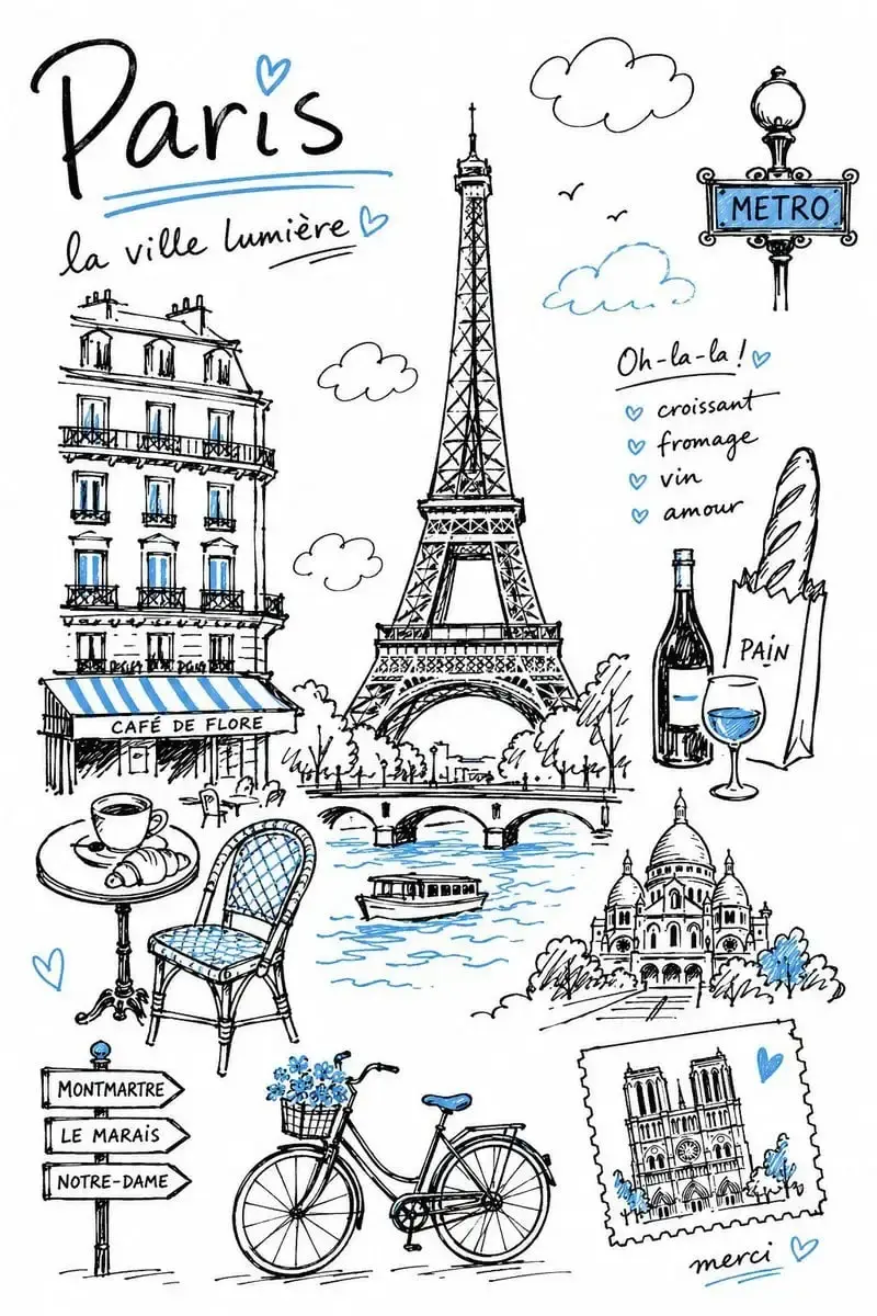
Copy this prompt:
Create a charming editorial travel illustration of [DESTINATION] in a simple hand-drawn doodle style, as if sketched with a black felt-tip marker in a travel notebook after a day of exploring. The result should feel personal, spontaneous, and slightly imperfect rather than digitally polished.

Color palette:

- Almost entirely black and white

- Use only one accent color: [ONE ACCENT COLOR]

- Apply the accent sparingly to selected details such as water, windows, signs, clothing, plants, or small architectural features

- Do not introduce any other color

Subject selection:
Choose a balanced set of details that immediately suggests [DESTINATION]:

- [LANDMARK 1]

- [LANDMARK 2]

- [LOCAL TRANSPORT]

- [REGIONAL FOOD OR DRINK]

- [NATIVE PLANT OR ANIMAL]

- [CULTURAL OBJECT]

- [NATURAL FEATURE]

Composition:

- Open editorial layout with generous white space

- Objects may overlap slightly but must not become crowded

- One clear title “[DESTINATION]” in casual hand lettering

- Optional short labels only from this approved list: [LABEL LIST]

- No dense realistic cityscape

Drawing style:

- Black felt-tip pen lines

- Slightly wobbly contours

- Natural line-weight variation

- Loose marker strokes

- Occasional open line endings and overlapping marks

- Flat simplified shapes with minimal interior detail

- Confident but handmade appearance

Mood: warm, friendly, relaxed, playful, contemporary, and elegant through restraint.

Do not use photorealism, 3D rendering, painterly effects, gradients, heavy shadows, glossy lighting, vector-clean curves, excessive detail, or a busy composition. Output a vertical 3:4 illustration with a flat handmade editorial feel and no watermark.
Change these details: Destination, one accent color, landmarks, transport, food, natural feature, and approved labels.
Why it works: The one-color rule and line-quality instructions define a repeatable visual system. The source version switched from a variable accent color to blue halfway through; this version keeps the chosen color consistent.
If it looks too digital:
Keep the destination elements, title, accent color, layout, and white space unchanged. Redraw only the linework with uneven black felt-tip strokes, variable pressure, small overlaps, open line endings, and minor hand-drawn inaccuracies. Remove gradients, smooth vector curves, realistic shading, and glossy effects.
The Best Prompt Structure for Nano Banana Pro
A long prompt is not automatically a good prompt. The useful part is the order of operations: tell the model what it is doing, identify the subject or reference, define the new result, then lock the elements that must not change.
Google's current image documentation describes Nano Banana Pro as Gemini 3 Pro Image and positions it for complex visual tasks, brand consistency, localization, and precise creative control. Its image workflow supports generation, editing, and conversational refinement with text and image inputs. See the official Gemini image-generation documentation.
For Text-to-Image Generation
[Deliverable] + [Subject] + [Action] + [Environment] + [Composition] + [Lighting and materials] + [Exact text] + [Output constraints]
Example:
Create a vertical paid-social poster for a sparkling tea. Show one cold can held close to the camera on a city rooftop at sunset. Use a 24mm low-angle perspective, warm rim light, a muted coral-and-navy palette, and the exact headline “A Better 3 PM.” Keep the can unobstructed. Output 4:5 with no platform UI or extra text.
For Reference-Based Generation
Google's own prompt formula is concise: reference images, their relationship, and the new scenario. In practice, it helps to add a preservation block:
[Role of each reference image] + [What must stay unchanged] + [New scene or action] + [Composition] + [Output constraints]
Example:
Use Image 1 as the exact product reference and Image 2 as the lighting reference. Preserve the product's packaging, logo, label, proportions, and colors. Place it on a pale stone bathroom vanity with the soft window light shown in Image 2. Create a 4:5 ecommerce campaign image with no extra products or text.
For Image Editing
[What to change] + [What to preserve] + [How the edited area should match the image] + [What not to add]
Example:
Replace only the background with a warm off-white studio wall. Keep the person, face, hair, pose, clothing, crop, camera angle, and foreground shadows unchanged. Match the existing light direction and depth of field. Do not add props or text.
For Images with Exact Text
[Layout] + [Exact quoted copy] + [Font category] + [Position] + [Hierarchy] + [No-extra-text rule]
Do not bury the copy inside a paragraph of style words. Put every required line in quotation marks and specify where it belongs.
7 Nano Banana Pro Prompting Tips That Improve Results
1. Start with the operation
“Create a poster,” “edit the uploaded image,” and “build a 3 × 3 comparison grid” give the model three different jobs. Name the job in the first sentence.
2. Describe visible decisions, not vague quality
“Professional” does not tell the model where the product sits, how it is lit, or which material should catch the highlight. A three-point softbox setup, a 50mm eye-level portrait, or a matte paper texture gives it something visible to render. Google's Nano Banana prompting guide similarly recommends directing lighting, camera and lens, color treatment, and material texture.
3. Put exact image text inside quotation marks
List the headline, subline, CTA, and labels separately. Then add: “Use this exact text and no other copy.” Check the output manually anyway. One wrong digit in a price or product claim is enough to make an otherwise good ad unusable.
4. Assign a role to every reference image
Do not upload three images and assume the relationship is obvious. Say “Image 1 is the product,” “Image 2 is the person,” and “Image 3 controls the lighting and palette.”
5. Separate “preserve” from “change”
For editing, write one sentence naming the requested change and another naming the locked elements. This is especially important for faces, packaging, logos, camera angles, and room layouts.
6. Set the aspect ratio in both the prompt and interface
Use the ratio selector in your generator when it is available. A Midjourney-style suffix such as --ar 9:16 is not a universal image-model command, so writing “vertical 9:16 composition” in the prompt is clearer.
7. Repair one problem at a time
If the first image has a wrong label, do not regenerate the entire concept with a new prompt. Ask the model to preserve the composition and correct only the label. Multi-turn editing is most useful when the correction is narrow.
How to Use These Nano Banana Pro Prompts in GPT Proto
Open the GPT Proto AI image generator.
Select Nano Banana Pro from the available image models.
Copy one prompt and replace every bracketed variable.
Upload the reference images listed in the prompt card. Use clear, uncropped product or portrait references when identity matters.
Choose the recommended aspect ratio and the highest resolution appropriate for the final placement.
Generate the first image, inspect the product, face, hands, labels, and factual details, then paste the repair prompt for one focused correction.
The generator gives you one place to try the prompt. The judgment still belongs to you. Product claims, prices, measurements, maps, medical copy, and brand assets should always be verified before the image goes live.
Create an image with GPT Proto
Want More Nano Banana Pro Prompt Ideas?
The 20 examples above are a curated starting set. For a larger visual collection, browse the Nano Banana Pro prompt gallery and remix an example around your own product, character, or campaign.
If you found these prompts through Banana Prompts XYZ, these two guides explain where that site helps and when a more direct copy-and-remix workflow is faster:
You can also return to GPT Proto to explore other image and video models in the same workspace.